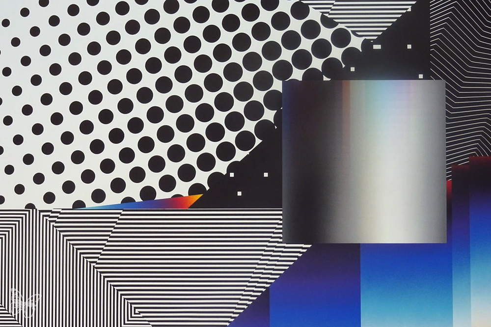
The work of Spanish-Argentine artist Felipe Pantone breaks down the barriers between the virtual world and physical reality through real-time capture of CMYK color theory, moiré patterns, and digital glitch. His methods resonate with Arthur Dorval's geometric compositions in a more disruptive modernity in terms of "color gradation" and "visual depth."
Creative methods: Algorithm-driven and physical translation of digital faults
Pantone's creative method is a deep sampling of the visual language of the digital age. The production logic of "the" does not begin with the canvas, but with complex digital modeling and parametric design.
- Topology refactoring for digital glitch: Pantone's core approach involves extracting the "glitch" textures produced when digital screens crash or are read at high speeds. This method breaks down the fluidity of classical painting. He uses modeling software to simulate abnormal reflections of light on curved surfaces and transforms them into highly complex diagonal grids. This technique "freezes" the digital errors that would otherwise vanish instantly into physical shapes, making them a geometric vehicle for exploring information overload and technological evolution.
- CMYK and rasterized color decomposition: His production logic is based on modern printing color theory (cyan, magenta, yellow, and black). He creates visual blending by "halftoning" colors, using extremely fine lines and dot arrangements. This technique essentially establishes a physical pixel system. Unlike Dorval's smooth overlay, Pantone pursues an extremely high-frequency visual pulse, creating a self-illuminating illusion similar to an LCD screen through the intense conflict between adjacent colors.
- Motion sensing and dynamic parameter design: Pantone's compositions often possess a strong sense of "flow." He uses vector graphics software to calculate the motion blur effect created by the stretching and compression of shapes in space. This technique forcibly injects the dimension of time into static geometry, making it appear as if it were a snapshot captured at the speed of light. This method breaks the static nature of easel painting, giving the image a real-time feel reminiscent of digital streaming media.
Stylistic characteristics: Technological dynamics, high-energy contrast, and perceptual overclocking
Pantone's style presents a visually violent, dazzling, sharp, and technologically optimistic quality.
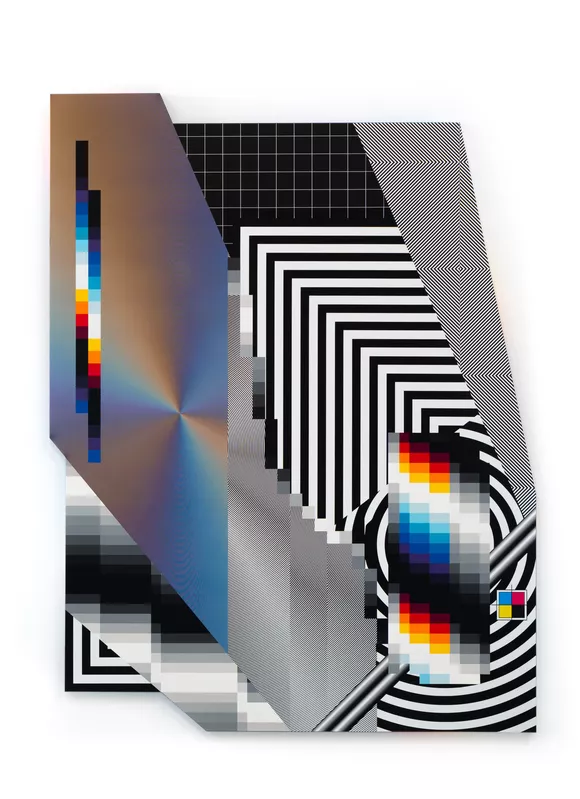
- Techno-Kineticism: His style is a variation of traditional kinetic art (such as Soto and Cruz-Diez) in the internet age. Stylistic characteristics include the coexistence of extremely high color saturation and high-frequency black and white lines. This stylistic feature bridges the gap between "high technology" and "high sensibility." The images often present a texture reminiscent of electronic chips, fiber optic networks, or liquid metal, reflecting the data-driven nature of contemporary society.
- Retinal Overclocking: Pantone's work is characterized by a strong "retinal aggression." Due to the extensive use of high-contrast primary colors and dense geometric textures, viewers often experience a sense of visual overload. This stylistic feature breaks down the traditional aesthetic distance of art, instead pursuing a direct, physiological impact. This style forms an extreme contrast with Dorval's profound tranquility—Dorval's work is a slow incubation, while Pantone's is an instantaneous explosion.
- A balanced mix of digital and analog: Pantone excels at preserving a certain "dynamic chaos" within extreme industrial precision. Despite the overall composition being extremely intricate, the random distribution of faulty textures lends the work an unpredictable sense of nature. This balance establishes the work's unique position between "digital rationality" and "human error."
Materials used: High-precision industrial coatings, integration of PMMA and UV printing
Pantoni demonstrated an extreme use of modern industrial productivity in his choice of materials, regarding the canvas as a precision-machined industrial component.
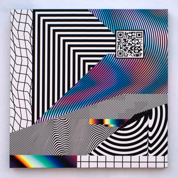
- Interaction between PMMA (acrylic) and light guide materials: Acrylic is the core material carrier of Pantone. Utilizing the excellent light transmission properties of highly transparent acrylic, they perform laser cutting and layering between different layers. Through precise polishing of the acrylic edges, they achieve total internal reflection of light within the sheet, simulating the luminous edges of a digital interface. This method of material application transforms "physical properties" into "optical properties."
- The fusion of automotive paint and UV digital printing: Pantone extensively uses industrial-grade automotive metallic paint and fluorescent coatings to achieve a color brightness that surpasses that of nature. Simultaneously, it combines this with high-precision industrial-grade UV printing technology to achieve complex gradient effects on uneven 3D surfaces. This material application method overcomes the texture limitations of hand-painted finishes, ensuring that every geometric edge possesses the absolute precision of a CNC machine tool.
- Aluminum composite panels and industrial bonding systems: To support the complex geometry, he often uses lightweight yet robust aluminum composite panels as a base. Through industrial-grade bonding and fastening systems, he combines hundreds of individual geometric modules into a vast visual matrix. This engineered treatment of rigid materials transforms the artwork from a painting into a sophisticated optical device that captures ambient light.
 简体中文
简体中文  English
  日本語
日本語  Español
  Français
  हिन्दी
  العربية
  বাংলা
বাংলা  Português do Brasil
  Русский
  اردو
اردو  Bahasa Indonesia
  Deutsch
  Kiswahili
  मराठी
मराठी  తెలుగు
  Tiếng Việt
  Türkçe
  Italiano
  தமிழ்
தமிழ்  한국어
한국어