
Josef Albers
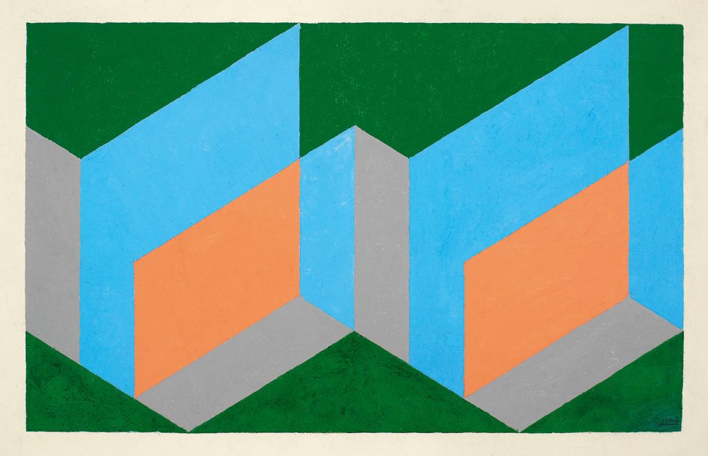
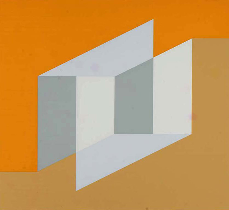
In geometric abstract art, color is not merely a decorative element attached to the surface of forms; it often plays a crucial role in activating structure, strengthening visual relationships, and generating a sense of space. Geometric forms are typically composed of lines, boundaries, and proportional relationships, possessing a high degree of rationality and order. However, relying solely on lines or a single hue can easily make the image appear static and lack visual tension. The intervention of color can imbue these rational geometric structures with new visual energy, thereby "activating" the forms and allowing them to present a richer visual expression in two-dimensional space. Therefore, the use of color in geometric abstract art is primarily manifested in the activation and enhancement of geometric forms.
First, color can enhance the clarity of the boundaries and structure of geometric forms. In many abstract geometric works, differences between forms are often distinguished by the use of different colors. When different geometric units are given different colors, viewers can quickly identify each structural area, thus understanding the overall composition. Color here is not only a way of filling, but also a visual marker; it strengthens the boundaries of forms through color differences, making the geometric structure clearer. When color and linear structure work together, the outlines and proportions of geometric forms become more prominent, thus forming a visually ordered system.
Secondly, color can imbue geometric forms with visual energy. In a purely black and white structure, geometric forms often exhibit a stable and rational order, while the addition of vibrant color gives them a distinct visual vitality. Highly saturated colors can create strong visual appeal, making certain forms the focal point of the image. Through the contrast of color intensity, visual tension is created between geometric units, resulting in a dynamic rhythm in the entire composition. For example, in structures composed of rectangles, squares, or triangles, the use of high-contrast colors such as red, blue, and yellow can create a striking and powerful visual effect from simple forms.
Josef Albers
Third, color can alter the spatial perception of geometric forms. On a two-dimensional plane, geometric forms themselves do not possess true spatial depth, but through the brightness and warmth of colors, spatial layers can be visually created. For example, brighter or warmer forms tend to stand out more visually, while darker or cooler forms tend to recede. This visual principle can be used by artists to organize the space within a picture, creating a sense of depth between different geometric forms. In this way, color not only activates the forms themselves but also creates a more complex spatial structure within the image.
Furthermore, color can reinforce the overall order of geometric structures through rhythm and repetition. When a certain color appears repeatedly in different locations, the viewer's eye will form visual connections between these locations, thus creating a sense of rhythm in the image. This repetition and echoing of colors connects scattered geometric forms, thereby strengthening the overall structure. For example, in grid-like geometric compositions, repeating a certain color in different areas can establish visual paths, giving the viewer a continuous visual experience during viewing. Color here not only activates individual forms but also the entire structural system.
Josef Albers
Color can also alter the emotional character of geometric forms. Different colors often evoke different psychological feelings; for example, warm colors typically convey activity and passion, while cool colors tend to express stability, rationality, or tranquility. When these colors are applied to geometric forms, they directly influence the viewer's overall perception of the form. For instance, the same square structure may appear strong and energetic when using highly saturated warm colors, while it may present a calm and restrained character when using low-saturation cool colors. Therefore, color not only changes the visual effect of a form but also alters its emotional expression.
Overall, the role of color in geometric abstract art is to breathe new visual life into rational geometric structures. Through contrast, rhythm, spatial relationships, and emotional suggestion, color can activate originally static geometric forms, creating rich visual variations on a two-dimensional surface. It is precisely in this interactive relationship between color and structure that geometric abstract art has formed a unique and vibrant visual language, enabling simple geometric elements to exhibit multi-layered visual expressiveness.
Module 1: How Color "Activates" Geometric Forms (Click to view and listen to the reading)
In geometric abstract art, color is not merely a decorative element attached to the surface of forms; it often plays a crucial role in activating structure, strengthening visual relationships, and generating a sense of space. Geometric forms are typically composed of lines, boundaries, and proportional relationships, possessing a high degree of rationality and order. However, relying solely on lines or a single hue can easily make the image appear static and lack visual tension. The intervention of color can imbue these rational geometric structures with new visual energy, thereby "activating" the forms and allowing them to present a richer visual expression in two-dimensional space. Therefore, the use of color in geometric abstract art is primarily manifested in the activation and strengthening of geometric forms. Firstly, color can enhance the boundaries and structural clarity of geometric forms. In many geometric abstract works, differences between forms are often distinguished through the arrangement of different colors. When different geometric units are given different colors, viewers can quickly identify each structural area, thereby understanding the overall composition. Color here is not only a filling method but also a visual marker; it strengthens the boundaries of forms through color differences, making the geometric structure clearer. When color and line structure work together, the outlines and proportions of geometric forms become more prominent, creating a visually ordered system. Secondly, color imbues geometric forms with visual energy. In a pure black and white structure, geometric forms often exhibit a stable and rational order, while the addition of vibrant color gives them a distinct visual vitality. Highly saturated colors create strong visual appeal, making certain forms the focal point of the image. Through contrasting color strengths, visual tension is created between geometric units, resulting in a dynamic rhythm in the overall composition. For example, in structures composed of rectangles, squares, or triangles, the use of high-contrast colors such as red, blue, and yellow can create a striking and powerful visual effect from simple forms. Thirdly, color can alter the spatial perception of geometric forms. On a two-dimensional plane, geometric forms themselves do not possess true spatial depth, but through the brightness and warmth of colors, spatial layers can be visually created. For example, brighter or warmer forms tend to stand out more visually, while darker or cooler forms tend to recede. This visual principle can be used by artists to organize pictorial space, creating a sense of depth between different geometric forms. In this way, color not only activates the form itself but also creates a more complex spatial structure within the image. Furthermore, color can reinforce the overall order of geometric structures through rhythm and repetition. When a certain color appears repeatedly in different locations, the viewer's eye forms visual connections between these locations, creating a sense of rhythm within the image. This repetition and echoing of color connects scattered geometric forms, thereby strengthening the overall structure. For example, in grid-like geometric compositions, repeating a certain color in different areas can establish visual paths, creating a continuous visual experience for the viewer. Here, color not only activates individual forms but also the entire structural system. Color can also alter the emotional character of geometric forms. Different colors often evoke different psychological feelings; for example, warm colors typically convey activity and passion, while cool colors tend to express stability, rationality, or tranquility. When these colors are applied to geometric forms, they directly affect the viewer's overall perception of the form. For instance, the same square structure may appear strong and energetic when using highly saturated warm colors, while it may present a calm and restrained character when using low-saturation cool colors. Therefore, color not only changes the visual effect of a form but also alters its emotional expression. Overall, the role of color in geometric abstract art is to breathe new visual life into rational geometric structures. Through contrast, rhythm, spatial relationships, and emotional suggestion, color can activate originally static geometric forms, creating rich visual variations on a two-dimensional surface. It is precisely in this interactive relationship between color and structure that geometric abstract art has formed a unique and vibrant visual language, enabling simple geometric elements to exhibit multi-layered visual expressiveness.