
13. Color relationships are generated through contrast.
Johannes Itten
In the development of modern color theory in the 20th century, Johannes Itten established a systematic and clear methodology for color research. His theory emphasizes that color is not an isolated visual element, but rather generates meaning through interrelationships. Among these relationships, contrast is the most important mechanism. It is through different forms of contrast that the differences between colors are amplified, thereby forming visual order. Therefore, in Itten's theoretical system, color relationships are generated through contrast.
Itten argues that human vision is highly sensitive to differences. When two colors appear simultaneously, the visual system automatically compares their attributes such as brightness, warmth, saturation, and area. This comparison process makes the differences between colors more pronounced, resulting in a strong visual effect. Without contrast, the relationships between colors become blurred, and the image loses its vitality.
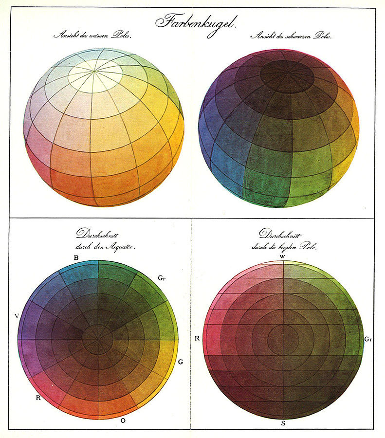
To systematically study this phenomenon, Itten proposed the famous theory of "seven color contrasts." These seven contrast methods reveal the relationships between colors from different perspectives, including hue contrast, brightness contrast, warm/cool contrast, complementary color contrast, simultaneous contrast, chroma contrast, and area contrast. These contrasts do not exist in isolation, but can interact within the same image to form a complex visual structure.
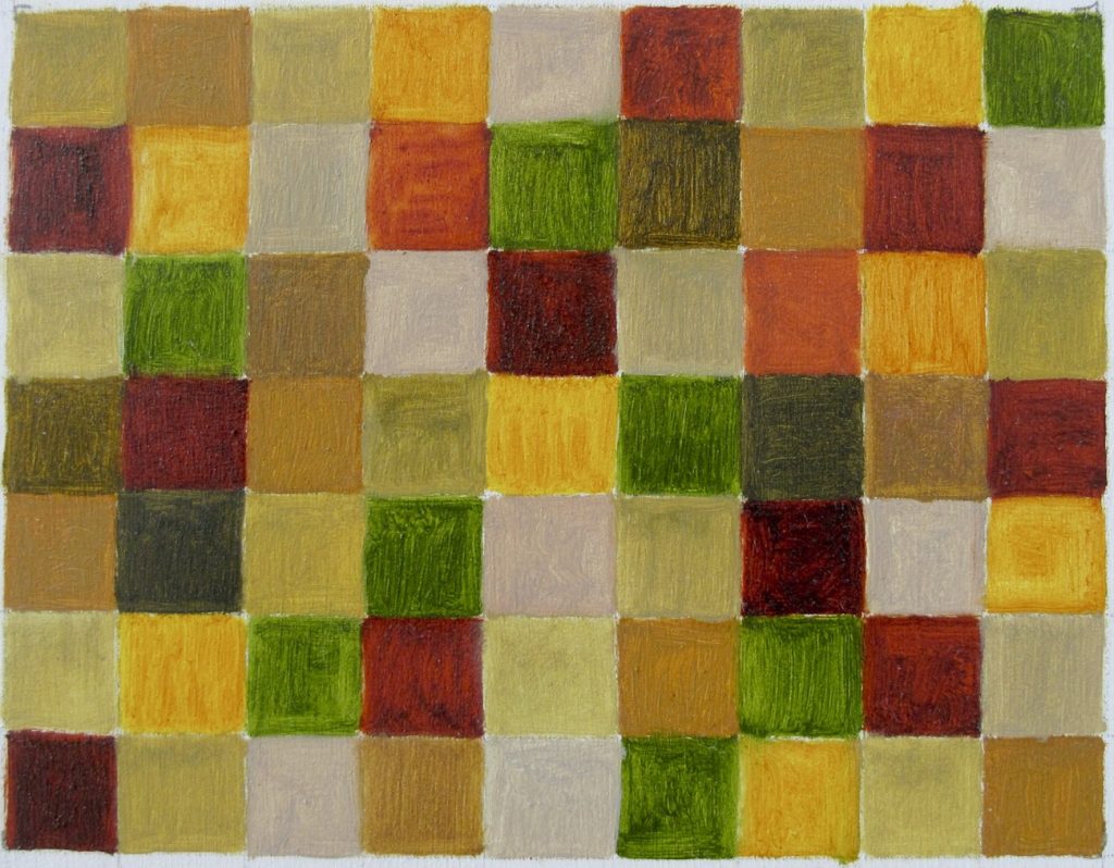
Hue contrast is the most basic form. When two colors with different hues are placed side by side, such as red and blue, or yellow and green, the visual difference is immediately apparent. The greater the difference in hue, the stronger the contrast effect. Combinations of pure primary colors often produce the most striking visual impact because they have obvious differences on the color wheel.
Johannes Itten
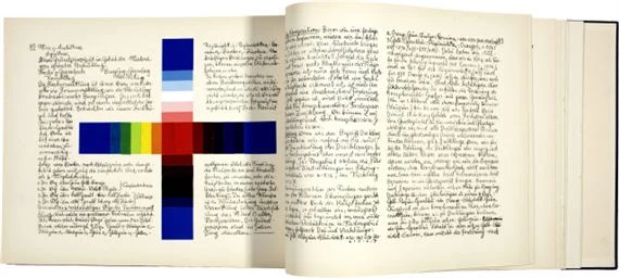
Brightness contrast focuses on the relationship between light and dark colors. When dark and light colors are placed side by side, a clear visual hierarchy is created. For example, the strongest brightness contrast is between white and black, while the contrast between gray and light gray is softer. By adjusting the brightness relationships, artists can control the sense of space and visual focus in a painting.
The contrast between warm and cool colors is related to the visual perception of temperature. Generally speaking, colors such as red, orange, and yellow are considered warm colors, while blue, cyan, and purple are considered cool colors. When warm and cool colors appear together, the image creates a distinct spatial effect. Warm colors tend to appear closer to the viewer, while cool colors seem to recede. Through this relationship, artists can create spatial layers on a two-dimensional surface.
Complementary color contrast is another important relationship. Colors opposite each other on the color wheel are called complementary colors, such as red and green, blue and orange, and yellow and purple. The visual contrast is strongest when complementary colors are placed side-by-side because the two colors form a complementary relationship in the visual system. Complementary color contrast often brings a strong visual impact, making the image vibrant.
Simultaneously, contrast involves changes in visual perception. When one color is surrounded by another, the human eye automatically generates a contrast effect, making the color appear different. For example, gray placed against a red background will appear greenish, while against a blue background it may appear orange. This phenomenon illustrates that color perception is not fixed but constantly changes in relation to other colors.
Purity contrast focuses on differences in color saturation. When a pure color is placed next to gray or a low-saturation color, the pure color will appear more vibrant. Through this contrast, artists can emphasize key elements in the image and make certain areas stand out.
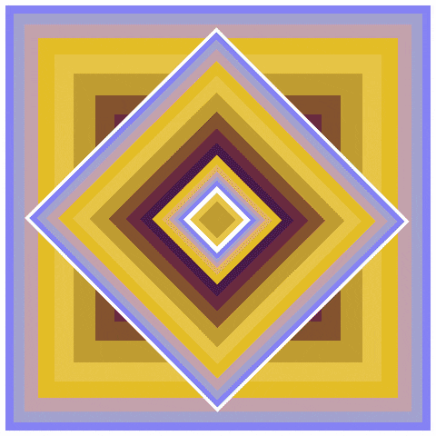
Area contrast involves the proportional relationship of colors within an image. Different colors have different visual power, so they need to be balanced through area proportions. For example, bright yellow usually requires a smaller area, while darker purple may need a larger area to create a stable relationship.
Johannes Itten
Through these different forms of contrast, colors form a complex yet orderly relational structure. Itten believes that artists should understand these contrast mechanisms when creating their works and construct visual order through reasonable combinations. Color is not just decoration used arbitrarily, but a visual language that creates structural relationships through contrast.
Therefore, in Johannes Itten's color theory, contrast is the core mechanism for generating color relationships. It is through various contrasting methods such as hue, value, warmth/coolness, and complementary colors that the differences between colors are amplified, thus forming a clear and dynamic visual structure. Contrast not only makes the image expressive but also provides the fundamental principles for color organization.
Lesson C-13: Color Relationships Generated Through Contrast (Click to view and listen to the reading)
In the development of modern color theory in the 20th century, Johannes Itten established a systematic and clear method for color research. His theory emphasizes that color is not an isolated visual element, but rather generates meaning through interrelationships. Among these relationships, contrast is the most important mechanism. It is through different forms of contrast that the differences between colors are amplified, thus forming visual order. Therefore, in Itten's theoretical system, color relationships are generated through contrast. Itten believed that human vision is highly sensitive to differences. When two colors appear simultaneously, the visual system automatically compares their attributes such as brightness, warmth, saturation, and area. This comparison process makes the differences between colors more pronounced, resulting in a strong visual effect. Without contrast, the relationships between colors become blurred, and the image loses its vitality. To systematically study this phenomenon, Itten proposed the famous theory of "seven color contrasts." These seven contrast methods reveal the relationships between colors from different perspectives, including hue contrast, brightness contrast, warmth/coolness contrast, complementary color contrast, simultaneous contrast, saturation contrast, and area contrast. These contrasts do not exist in isolation but can interact within the same image, collectively forming complex visual structures. Hue contrast is the most fundamental form. When two colors with different hues are placed side by side, such as red and blue, or yellow and green, the visual difference immediately becomes apparent. The greater the difference in hue, the stronger the contrast. Combinations of pure primary colors often produce the most striking visual impact because they have obvious differences on the color wheel. Brightness contrast focuses on the relationship between light and dark colors. When dark and light colors are placed side by side, a clear visual hierarchy is created. For example, white and black form the strongest brightness contrast, while the contrast between gray and light gray is softer. By adjusting brightness relationships, artists can control the sense of space and visual focus in a painting. Warm and cool color contrast is related to the perceived temperature. Generally speaking, colors such as red, orange, and yellow are considered warm colors, while blue, cyan, and purple are considered cool colors. When warm and cool colors appear simultaneously, the painting creates a distinct spatial effect. Warm colors tend to appear closer to the viewer, while cool colors seem to recede. Through this relationship, artists can create spatial layers on a flat surface. Complementary color contrast is another important relationship. Colors opposite each other on the color wheel are called complementary colors, such as red and green, blue and orange, and yellow and purple. The visual contrast is strongest when complementary colors are juxtaposed because the two colors form a complementary relationship in the visual system. Complementary color contrast often brings a strong visual vibration, making the image vibrant. Simultaneous contrast involves changes in visual perception. When one color is surrounded by another, the human eye automatically produces a contrast effect, making the color appear different. For example, gray placed against a red background will appear greenish, while against a blue background it may appear orange. This phenomenon illustrates that color perception is not fixed but constantly changes within relationships. Purity contrast focuses on differences in color saturation. When a pure color is juxtaposed with gray or a low-saturation color, the pure color will appear more vibrant. Through this contrast, artists can emphasize key elements in the image, making certain areas stand out. Area contrast involves the proportional relationship of colors within the image. Different colors have different visual power, so balance needs to be maintained through area proportions. For example, bright yellow usually requires a smaller area, while darker purple may require a larger area to form a stable relationship. Through these different forms of contrast, complex and orderly relational structures are formed between colors. Itten believes that artists should understand these contrast mechanisms when creating and construct visual order through reasonable combinations. Color is not merely arbitrary decoration, but a visual language that creates structural relationships through contrast. Therefore, in Johannes Itten's color theory, contrast is the core mechanism for generating color relationships. It is through various contrasting methods such as hue, value, warmth/coolness, and complementary colors that the differences between colors are amplified, thus forming a clear and dynamic visual structure. Contrast not only makes the image expressive but also provides the fundamental principles for color organization.