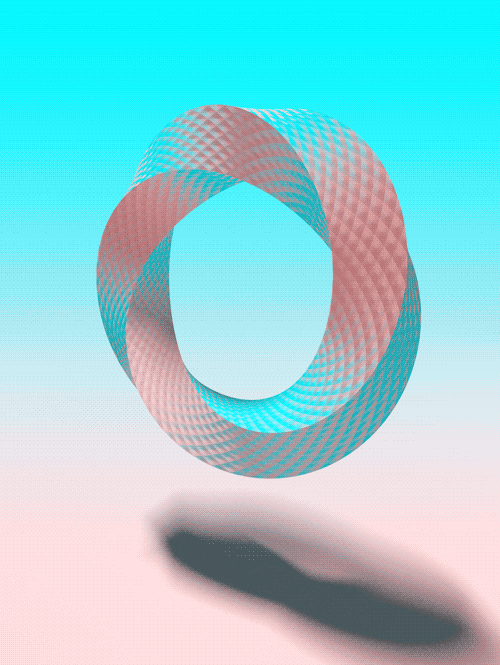
Spanish artist Jesús Perea's work breaks down the dichotomy between digital rationality and organic touch through the construction of minimalist geometric forms and subtle textural layering. His approach achieves a high aesthetic congruence with Arthur Dorval's geometric overlaps in “rigor of form” and “deep exploration of space,” but Perea, in a more “silent” and “poetic” manner, reduces abstraction to a pure experiment in balance.
Creative Method: A Hybrid Logic of Digital Priming and Manual Reconstruction
Pereia's creative process is one that repeatedly jumps between “precise algorithms” and “manual chance.” His logic of creation doesn't begin with intuition, but rather with an intellectual experiment regarding spatial ownership.
- Digital Sketching and Morphological Evolution: Perea's most crucial method is to utilize digital tools for early “space occupation.” He performs countless geometric proportion deductions on screen, a technique that resolves the ambiguity of proportion in traditional abstract painting. By making micron-level adjustments to every rectangle, circle, or line, he establishes a visually rigorous mother matrix. This is similar to Dorval's “incubation” logic – Perea first “incubates” the most perfect structural template in digital space.
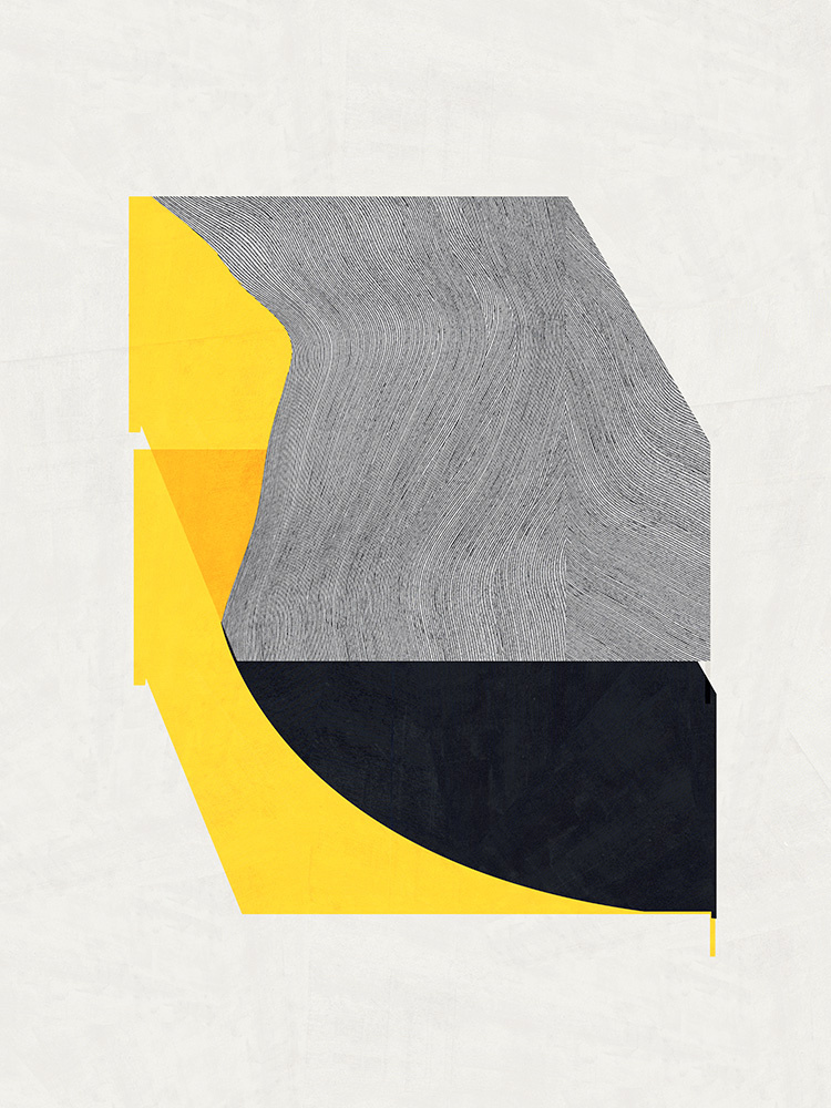
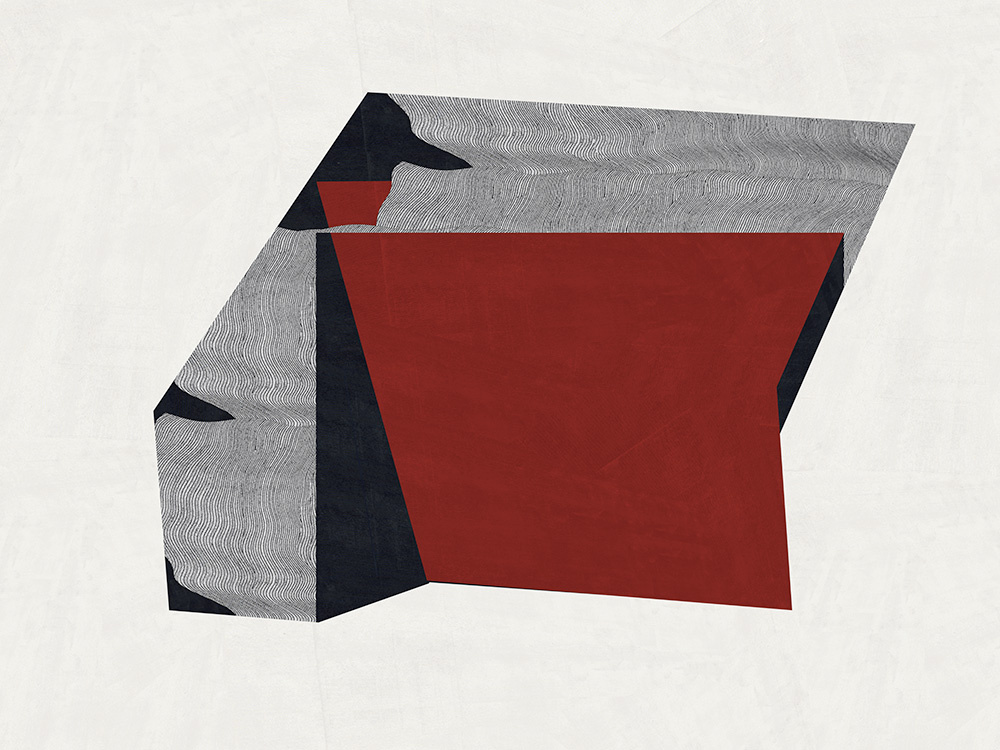
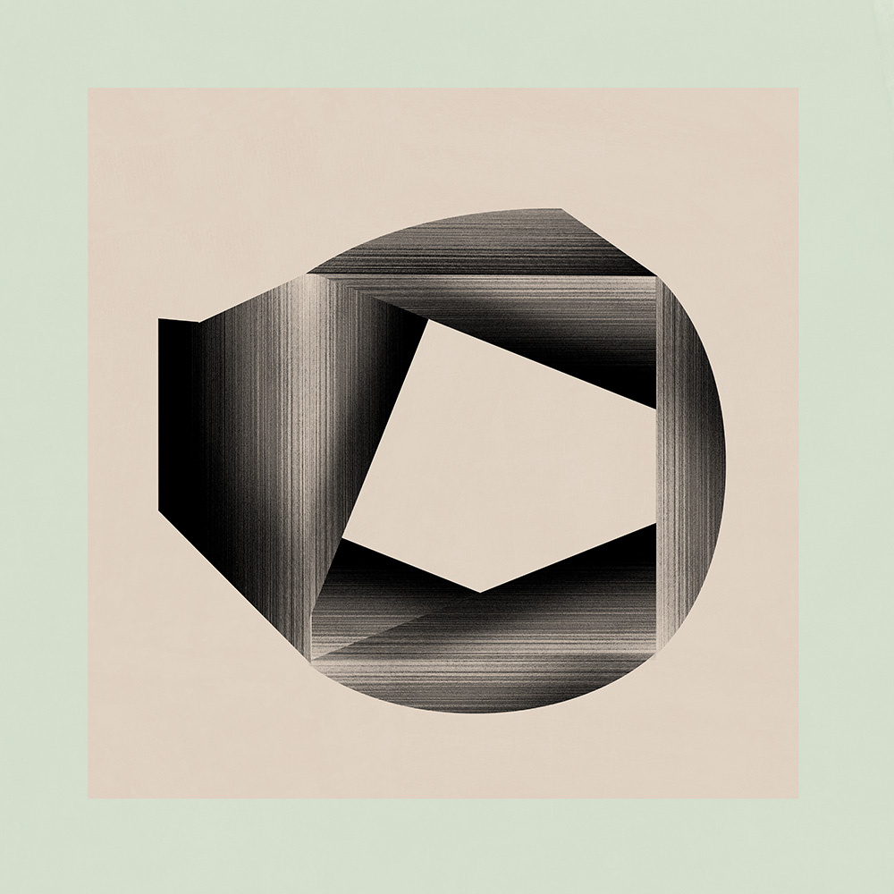
- Collage-based Tectonics His production logic involves a lot of physical collage. After determining the composition, Perea breaks it down into independent geometric units and reassembles them using materials of different textures or luminosities. This method breaks through the uniform texture of planar painting. Through tiny displacements and overlaps, he creates the illusion of “shapes pushing against each other.” When viewing, the audience can feel the invisible pressure between the geometric bodies, as if each block is searching for its final resting place on the canvas.
- Marginal Refinement Aesthetics: Perea is extremely sensitive to the treatment of geometric edges. He deliberately retains extremely subtle hand-cut marks or allows lines to create almost imperceptible breaks at certain nodes. This technique compels the viewer's brain to complete the shapes, utilizing “perceptual compensation” to create a visual depth that is more dynamic than closed shapes.
Style characteristics: Minimalism, a silent sense of space, and an organic balance of textures
Perea's style presents an extremely clean, solemn, and philosophically contemplative visual quality, simplifying complex realities into geometric truths.
- “Visual Narration of ”Silence": The most prominent characteristic of the Pereia style is the sense of tranquility in the artwork. By eliminating distracting ornamentation and strong color conflicts, the works present a meditative spatial atmosphere. This stylistic feature establishes the pieces as “vessels for thought.” Colors are often limited to beige, grayscale, navy blue, or muted earthy yellows, simulating the play of light and shadow on architectural stone under natural light, conveying a sense of eternal stability.
- The absolute equality of positive and negative space His stylistic characteristic is demonstrated in his shaping of “emptiness.” In Pereya's logic, uncolored areas possess the same visual weight as geometric blocks. This stylistic characteristic strips away the hierarchical relationship between background and subject. When viewers observe, their gaze continuously flips between “shape” and “nothingness,” generating metaphysical contemplation on “existence” and “non-existence.”
- Organic Balance Compared to Max Bill's mechanical precision, Pereia's style more strongly emphasizes the “order of life.” Despite rigorous composition, the soft edges and natural tones in his style make geometric shapes appear like fragments of ruins growing from the earth. This sense of balance establishes the work's unique position between “modern design” and “ancient totems,” recreating a kind of primal aesthetic that transcends time.
Material Usage: A Symphony of High-Weight Art Paper, Mixed Inks, and Graphite Textures
Perea demonstrates an extreme fascination with the “physical properties of paper” in his material selection, viewing his works as miniature landscapes that change with the angle of light.
- Paper as a metaphor for “skin”: He prefers art paper with special textures and high grammage. This use of materials transforms the “canvas” into a tangible “body.” Perea utilizes the paper's microfibers to capture light, allowing colors to exhibit a granular quality, as if powder were adhered to the surface, after being layered. The paper's white is not merely a color, but a physical base that is capable of breathing.
- Industrial Ink vs. Handmade Graphite Perea frequently combines highly precise digital inkjet inks with raw, handmade graphite applications. This approach to materials breaks down the coldness often associated with digital art. The metallic sheen left by the graphite creates a striking visual contrast with the matte texture of the ink, enhancing the image's depth and dimensionality. By repeatedly rubbing and pressing onto the paper, he allows the colors to penetrate deep into the fibers, revealing a mottled texture reminiscent of ancient building walls.
- Texture Sampling and Reconstruction To enrich the internal details of his geometric blocks, he collects texture photographs of marble, concrete, or rusted metal and transforms them into low-saturation graphics. This approach to material application gives simple geometric forms a sense of “material thickness,” making the originally flat color blocks appear as if they are weighty, cut architectural components.