Core purpose
”Color is not a material, but a language" as the core position, systematically combs through color inSymbolic dimension与Structural dimensiondual role in. The course aims to help learners understand: how colors generate meaning in different cultural, psychological, and artistic systems, and how colors participate in the construction of space and perception through relationships, rules, and structures. The emphasis is not on color techniques, but on establishing a way of thinking about color.
C2. Applied Color in Geometric Abstract Art
C2-1. How does color “activate” geometric shapes
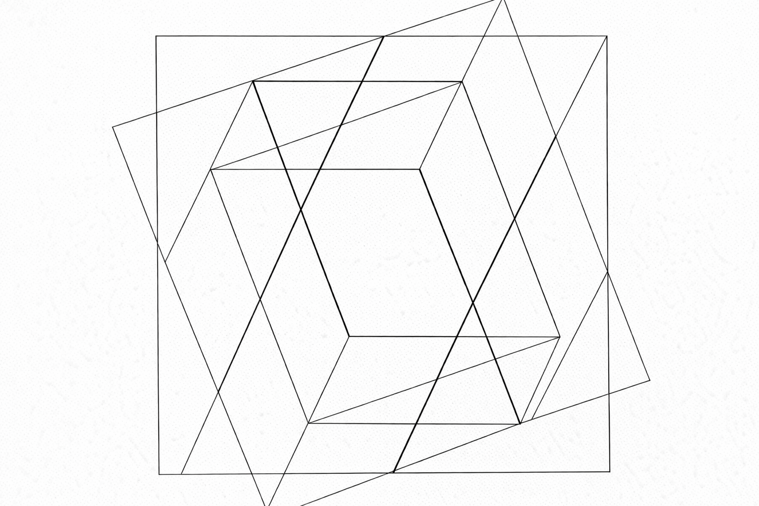
In geometric abstract art, geometric forms do not automatically generate meaning; they are truly “activated” only through the interplay of color relationships. Color is not a decorative layer applied to geometry but a key factor that directly participates in form perception. The same circle, square, or rectangle, in different color configurations, can present vastly different visual states such as stability, tension, expansion, compression, or floating. Through variations in lightness, warmth/coolness, contrast, and proportion, color alters the perceived weight and mode of existence of geometric forms in space, transforming originally neutral geometric structures into visual forms with clear perceptual direction. This module focuses on how color can reshape the perceptual attributes of form without altering the geometric structure, laying the foundation for subsequent more complex geometric-color systems.
C2-2. The conflict and balance between color and geometric order
Geometric structures are often seen as symbols of order, rationality, and stability. However, in geometric abstract art, this order is not solely determined by form itself. Instead, it is continuously reinforced, disrupted, or re-established through the intervention of color. Color can either obey geometric order, rendering structures clear, balanced, and stable, or it can break existing order through contrast, abruptness, and rhythmic variations, creating tension and uncertainty within rigorous geometric frameworks. This module focuses on how color confronts order within geometric systems and how it achieves renewed balance through this confrontation, helping us understand that geometry is not a static set of rules but a perceptual structure that constantly evolves due to color relationships.
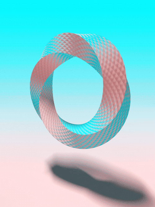
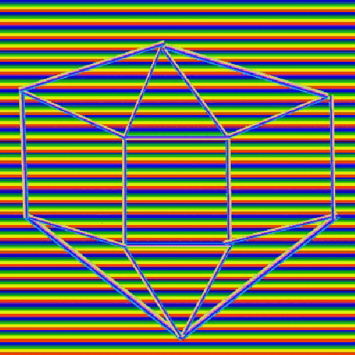
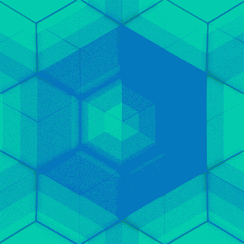
C2-3. Color Manufacturing Space: Advancing and Retreating in the Plane
In geometric abstract art, space is not dependent on perspective, light and shadow, or figurative cues to emerge, but can be entirely “created” on a two-dimensional plane through color relationships. Differences in hue, warmth/coolness, and saturation between various colors directly influence the visual advance and recession of forms, imbuing the plane with a sense of layering, depth, and volume. Here, color functions as a spatial constructor rather than mere surface embellishment. This module focuses on how to generate spatial perceptions of floating, receding, or expanding on a plane solely through color configurations, while maintaining the integrity of the geometric structure, thereby training sensitivity to the spatial behavior of color.
C2-4. Symbols are not drawn, but rather “read.”
In geometric abstract art, symbolic meaning is not presented directly through concrete imagery or explicit representation, but rather is “read” from the relationships of structure and color during the viewing process. Color itself does not carry fixed meanings, nor do geometric forms automatically point to emotions or concepts. The true symbolic feeling arises from the overall relationship constituted by both. When color enters a geometric system, it alters the weight, direction, and tension of the form, thereby triggering different psychological responses. This module emphasizes symbolism as a perceptual outcome rather than pre-supposed information, helping to understand how abstract works can generate perceivable and understandable meaning in the absence of narrative.
C2-5. System and Repetition: Color in Geometric Language
In geometric abstract art, color is not merely a choice to complete a single artwork; rather, it functions as a structural element that can operate continuously within a system. When geometric forms are modularized, repeated, or serialized, the role of color shifts from localized effect to an overall mechanism. Through rules, gradients, and parameter variations, color generates rhythm, hierarchy, and differences within repeating structures, allowing artworks to exhibit a visual logic that is both extendable and deducible. This module focuses on how color operates and changes within geometric systems, aiding in the understanding of abstract art's progression from single compositions towards language and methodology.
C2-6. The Use of Color Symbolism in Geometric Abstract Art
In abstract geometric art, the symbolism of color is not “explained” directly through explicit denotation or narrative, but rather gradually emerges from structure and relationships. Geometric forms provide a rational framework, and within this framework, color activates psychological and emotional perceptions, imbuing abstract forms with experiential meaning. Color symbolism is not a fixed label, but rather a result of perception generated through proportion, contrast, and systemic context. This module focuses on how to effectively convey symbolism in an abstract context by utilizing color relationships to guide viewers toward relatively consistent psychological experiences, while maintaining the autonomy of the geometric structure.
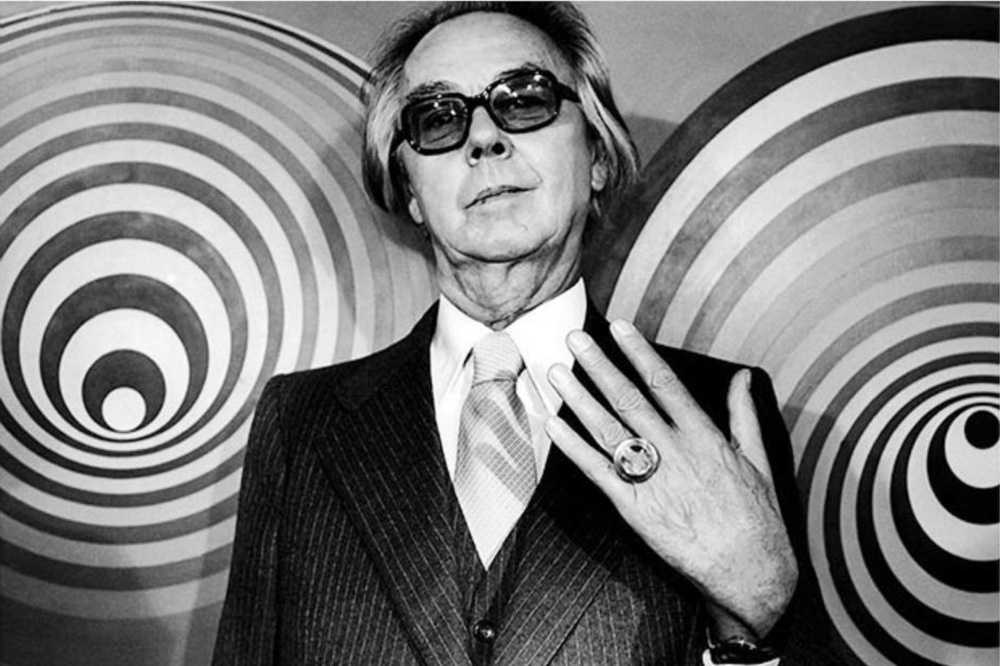
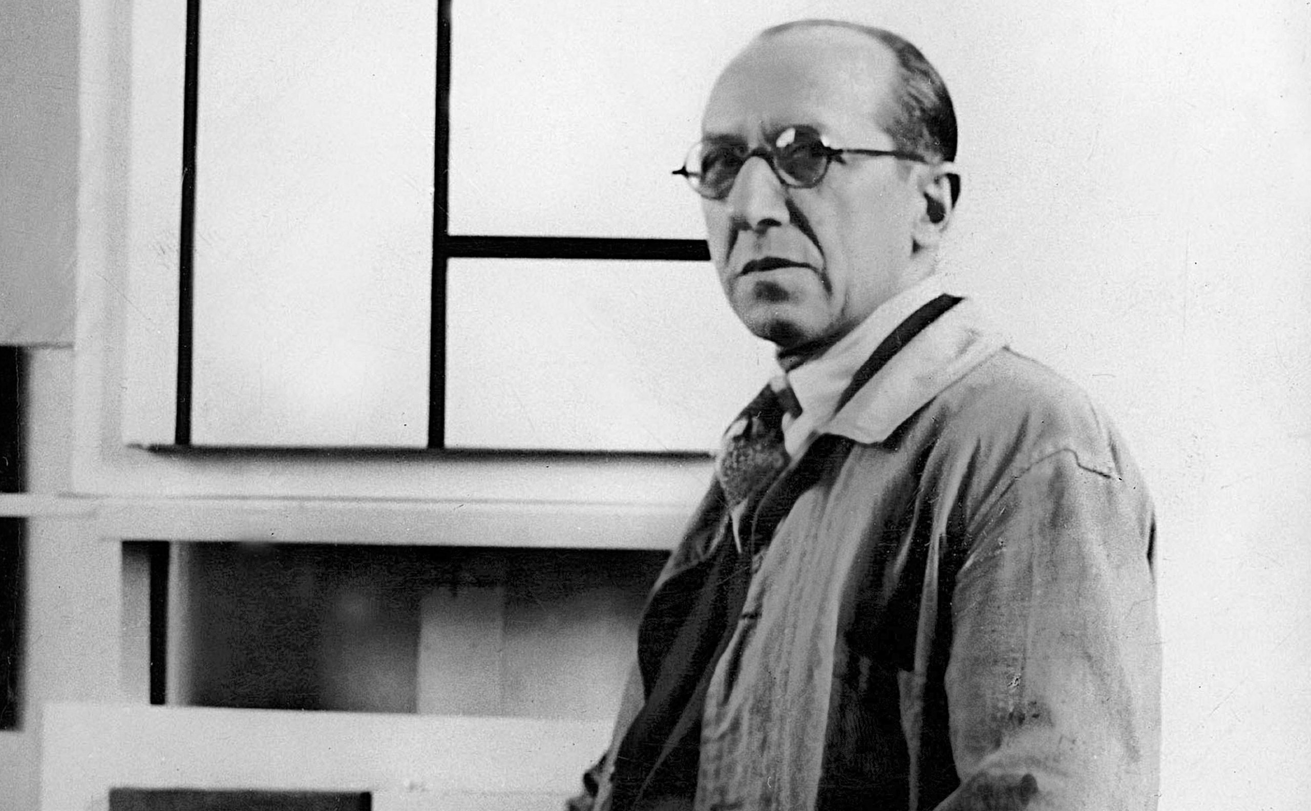
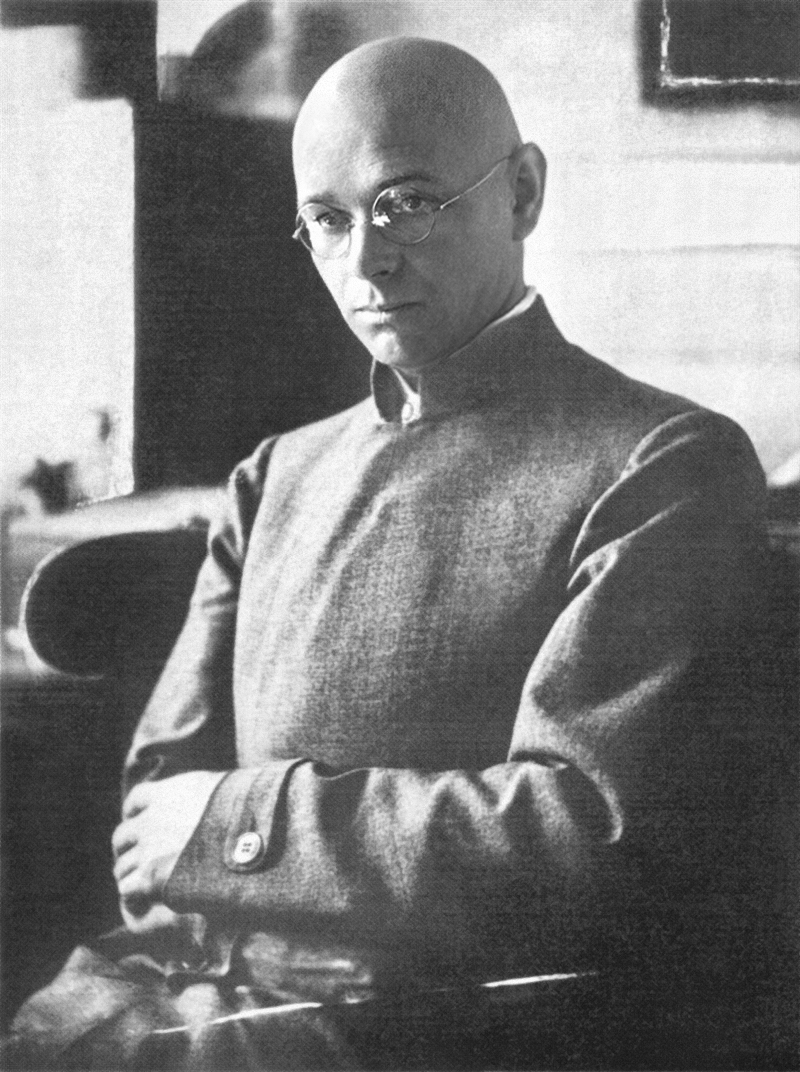
C3. Four core positions of modern color theory
Josef AlbersColor is not a fixed attribute, but a perceptual phenomenon that constantly changes in relation to others.
Piet MondrianColor must be strictly regulated in order to participate in the construction of a universal order that transcends individuals.
Victor VasarelyEmphasis: Color is a visual energy that can be systematically designed to create illusions of space and movement.
Johannes IttenProposal: Color relationships can be trained, analyzed, and mastered, and are a learnable system of contrasts.
C4-1, Course Test on Color Symbolism and Structural Relationships
Please submit your design once. Think carefully before clicking submit. Repeated submissions will result in deduction of points affecting the award!
C4. AI Color Symbolism and Structural Relationship Simulation System
AI Color Training Engine: Same Color, Different Feeling / Different Color, Same Feeling
Training ObservationSame color, different feeling experiment, different color, same feeling experiment
The perception of color is not stable, but is constantly shifting in relationship. The same color in different environments may present completely different weights, temperatures, and spatial sensations; while seemingly different colors may produce similar feelings in specific relationships. This training guides the observer to directly experience the relativity of colors in geometric structures through comparison and substitution, breaking the reliance on color names and intuitive judgments, and establishing a relationship-centered way of observing colors.
Structural Practice: Relational composition with a limited number of colors
When the number of colors is strictly limited, the relationships between colors will be significantly amplified. The success or failure of a composition will no longer depend on color richness but on the precise control of proportion, position, and contrast. This exercise, by limiting the number of colors, forces the observer to focus on how colors interact within a geometric structure, understanding that color is not effective by its quantity but truly comes alive when its relationships are clearly organized. This trains the ability to compose with structural thinking rather than color intuition.
Equipped with an 80-color full-spectrum standard color palette, it focuses on research into color contrast, harmony, and spatial expressiveness. An advanced flood fill algorithm ensures seamless overflow filling, and with local undo functionality, every color experiment can achieve precise visual presentation with millisecond-level feedback.
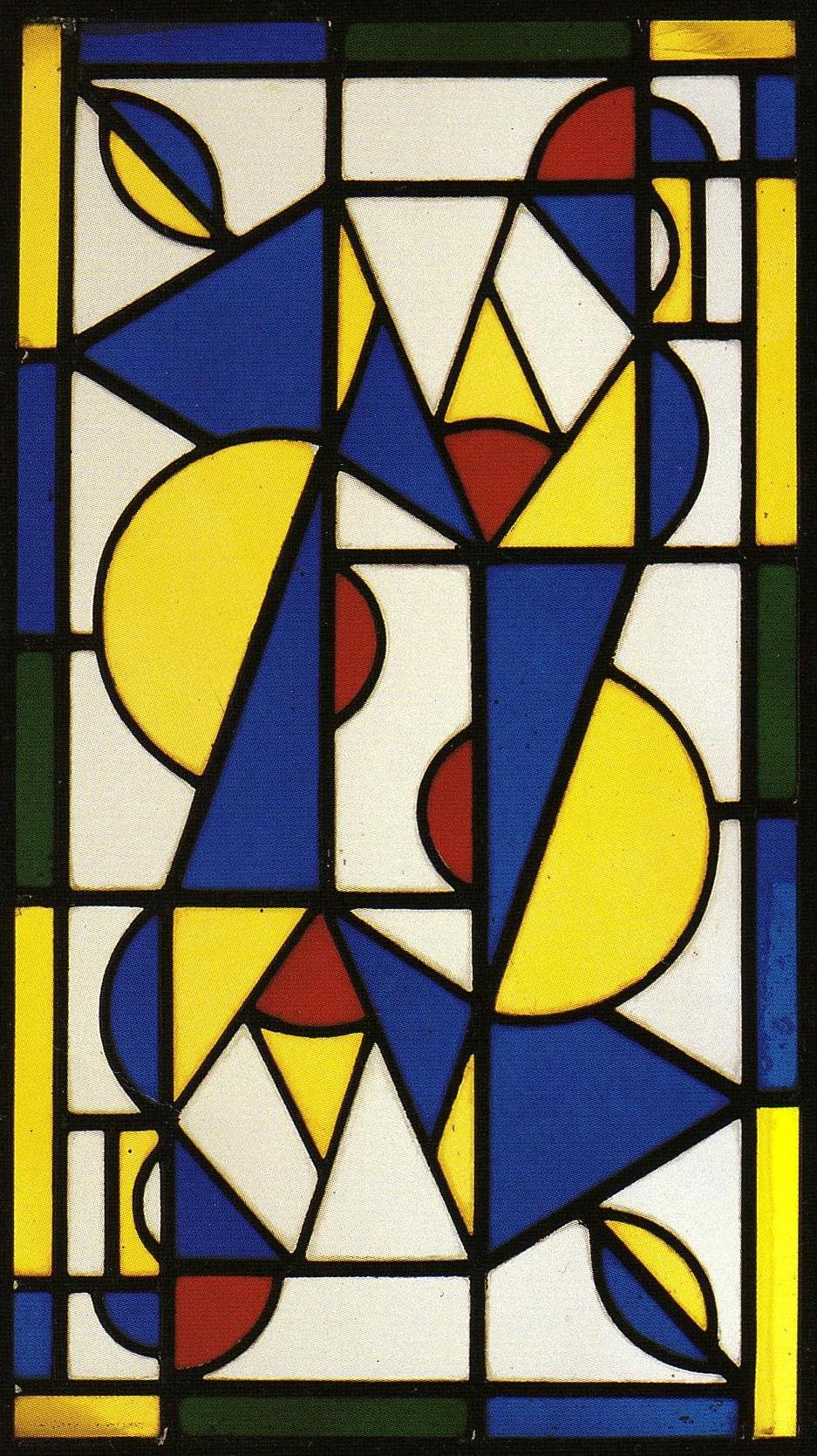
- First establish the black line framework, then decide where the color blocks will land. Color should serve the structure, not the other way around.
- Large areas of white space provide a sense of breathability, giving a small amount of primary color higher visual intensity.
- Red, yellow, and blue are distributed in different directions to avoid concentrating the color balance in a single corner.
- The color blocks are of different sizes, but achieve asymmetrical balance through edge relationships and spacing.
- The black lines are not decorative outlines, but structural boundaries that segment proportions and define rhythm.
- The black outline is not a decorative stroke, but rather the most basic rhythmic framework of the entire piece.
- The vertical, elongated structure first establishes a sense of standing, making all geometric changes seem to be attached to a body-like axis.
- The circles and semicircles are constantly cut, truncated, and flipped, so the sense of movement comes from geometric relationships rather than realistic postures.
- The large blue slanted column plays a dominant role in the image, resembling a continuous axis of motion running from top to bottom.
- The yellow arcs and triangular slices are responsible for converting the stable structure into a pulsating rhythm.
- Although the red area is small, it always appears near turning points and intersections, thus serving as an accent.
- White is not a blank background, but an important area for color blocks to breathe, separate, and glow.
- Green appears only sparingly at the edges; it is not the main element, but rather like the bass line in a rhythm.
- The partial approximation of symmetry, but not complete repetition, gives the work both order and vitality.
- Dance is not a visual narrative, but is perceived through the alignment, balance, and contrasting responses of geometric units.
- The works repeat with the exact same geometric grammar, illustrating that order does not depend on changes in shape, but on the progression of proportions.
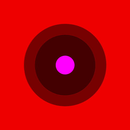
- The outermost yellow layer is not a residual background, but rather an active field that determines the overall sense of light and temperature tone.
- The large orange-red squares are responsible for transforming the external brightness into a more defined cohesive force.
- The middle reddish-purple layer acts as a buffer, preventing the outer heat from directly impacting the center; instead, it is first suppressed and calmed.
- The central deep red square is the smallest in area, but because of its central location and lowest brightness, it becomes the absolute visual focus.
- All sense of space is not caused by perspective, but by the visual depth induced by the relationship between color temperature, brightness, and area.
- The distance between the blocks is crucial; if the spacing becomes unbalanced, the overall sense of cohesion will be ruined.
- The boundaries are not divided by black lines, so the viewer can focus more on the interpenetration and mutual stimulation of colors.
- The concentric relationship brings stability, but the color gradient prevents this stability from becoming rigid, instead presenting a slow pulsation.
- The real complexity of this type of work lies not in the pattern, but in maintaining highly sensitive color relationships with very few variables.
- The outer contour adopts a rhomboid rotating structure, while the inner core remains a stable square, thus establishing directional tension in the image from the very beginning.
- The central white square is not blank, but rather the most important static core of the entire work, responsible for absorbing and stabilizing the surrounding color forces.
- The green trapezoid at the top and the red triangle at the top form a clear convergence at the top, giving the image a sense of upward convergence.
- The light blue structure on the left and the orange-cyan structure on the right resemble two sets of wings. They are not mirror images, but rather maintain balance in a state of imperfect symmetry.
- Yellow appears only partially on the left and right sides, so it is not the main color, but rather acts as a highlight and transitional element in the rhythm.
- The light pink stripe at the bottom is crucial; it subtly separates the white core from the green base, creating a more layered effect.
- The large yellow-green triangle at the bottom acts like a support surface or foundation, preventing the overall design from appearing floating due to excessive blank space in the center.
- All the color blocks have extremely clear boundaries with no blurred transitions, so the focus of the view is shifted to the proportions and directional relationships themselves.
- The artwork does not rely on perspective to create depth, but rather creates a sense of object-like stability through nested outlines and aligned color blocks.
- The charm of the entire piece comes from the precise control with very few variables: every edge, every facet, and every color cannot be easily changed.
- The work replaces free composition with modular repetition, so that the overall reading is based on system relationships.
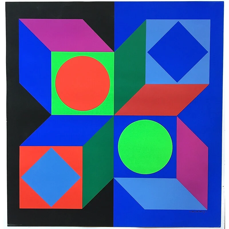
- Circles and rhombuses appear in pairs, so the image is not randomly pieced together, but rather maintains order through the echoing of shapes.
- The black left background and the blue right background form a large-scale background partition, providing a stable stage for the high-purity colors inside.
- The red circle in the upper left and the green circle in the lower right are not simply repeating each other, but rather forming a reversal relationship in terms of color, position, and background.
- The blue rhombus in the upper right and the light blue rhombus in the lower left form another set of mirrored echoes, giving the work a clear modular syntax.
- The central dark green vertical connecting surface is very important; it locks the two sets of structures on the left and right into a whole, rather than four separate pieces.
- The pink, light blue, and red sloping surfaces constantly break the stillness of the pure square system, giving the image a sense of sliding and rotation.
- The simultaneous appearance of high-purity blue, green, and red alongside lighter pink and light blue creates a rhythm that is both impactful and nuanced.
- Large forms are few, but each piece occupies a key position, so the precision of the work outweighs its complexity.
- The so-called optical sensation does not come from illusory distortion, but from the keen vibrations caused by module repetition, background switching, and boundary alignment.
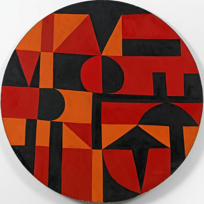
- The circular frame first changes the way the geometry is stressed, so that all horizontal and vertical relationships must find a new balance within the curved boundary.
- Black is not a background residue, but the core negative space framework of the entire work, responsible for segmentation, weighting, and pausing.
- Red carries the strongest visual emphasis and usually appears in modules that are large in area or in the most critical positions.
- Orange is not just an accompaniment; it often appears at turning points, connections, and changes in direction, thus having an accelerating effect.
- The fact that semicircles are always cut off or truncated suggests that curves here are not decorations, but rather rhythmic tools to break up the square system.
- The triangular and pointed structures constantly draw the eye from horizontal relationships to diagonal and vertical relationships, keeping the image in motion at all times.
- Long rectangles are responsible for establishing order, while semicircles and triangles constantly disrupt this order, thus the artwork has the characteristic of both stability and disturbance.
- The upper, middle, and lower zones are not treated the same: the upper zone is more focused on horizontal compression, the middle zone is more focused on curved resistance, and the lower zone emphasizes vertical segmentation and landing point.
- The color blocks are not isolated patterns, but rather like sentences in a finite grammar, constantly being reorganized in different positions.
- The work's strength comes from its extremely high degree of boundary clarity; every intersection of red, orange, and black directly determines the rhythm.
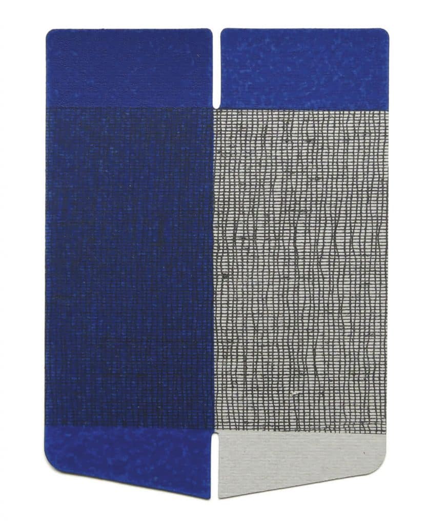
- The artwork replaces complex modules with two juxtaposed panels, allowing the viewer to focus first on the juxtaposition, spacing, and material differences.
- The blue panel on the left conveys a sense of weight, while the white and gray fabric on the right provides a sense of breathability, creating a contrast between solid and light curtain-like structures.
- The black grid is not an added decoration, but rather a direct introduction of materiality into the core language of geometric structure.
- The two small notches at the top and bottom of the middle are crucial; they connect the two panels yet separate them, creating a precise sense of pause.
- The rounded corners at the top reduce the mechanical feel of a pure rectangle, making the object look more like a processed sheet or fabric sample.
- The beveled bottom edge gently breaks the absolute stability of the vertical system, giving the whole a tendency to open, close, and turn.
- The blue on the left appears darker and denser under the grid, illustrating how color changes visual weight depending on surface texture.
- The white-gray area on the right is not blank, but becomes a readable fabric field due to the black warp and weft mesh.
- The number of colors is strictly limited, so subtle differences in proportion, gaps, boundaries, and textures become the true content.
- The complexity of the entire work is compressed into very few variables, which is an important characteristic of subtractive geometry and material abstraction.
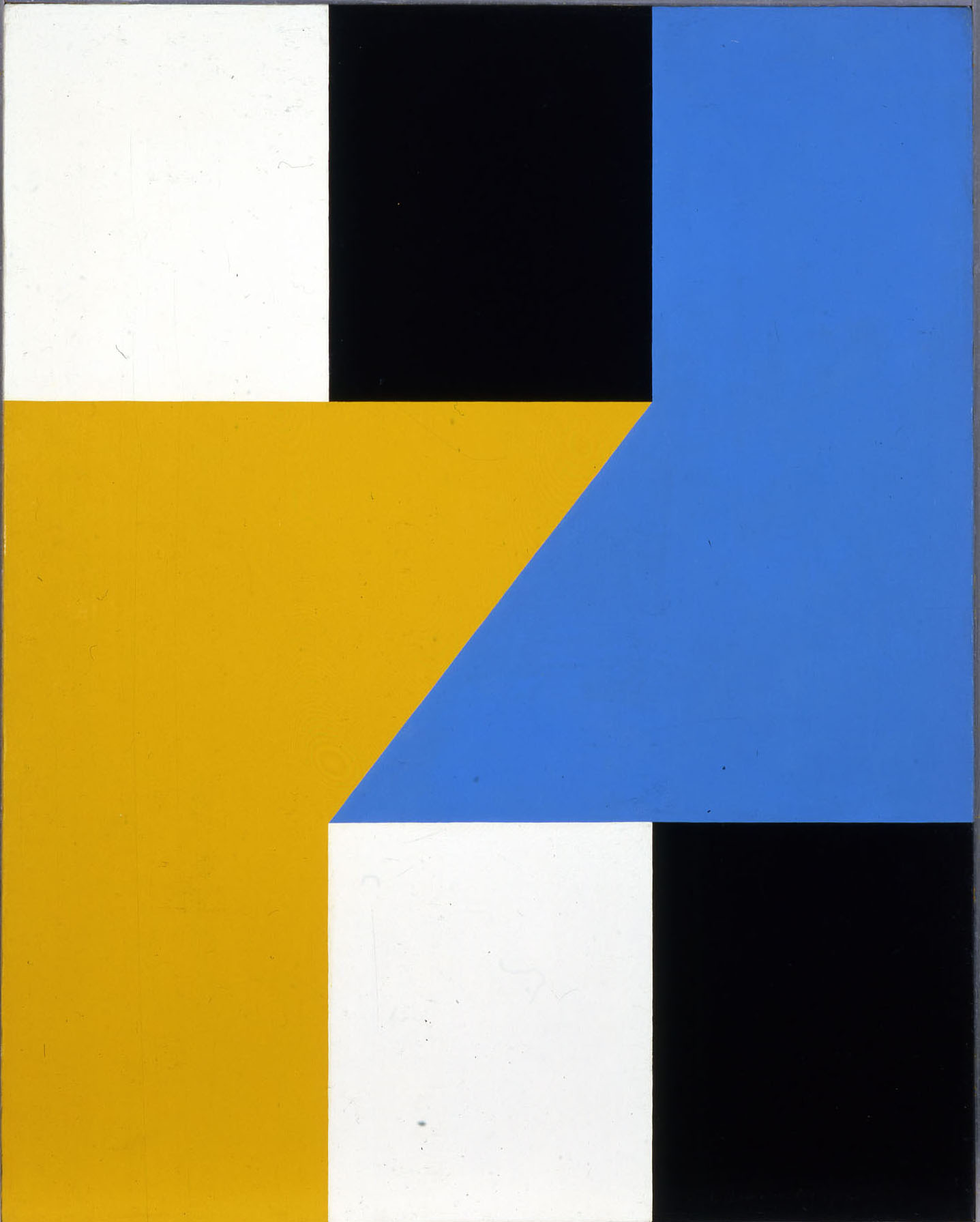
- The work establishes maximum tension with minimal form, demonstrating a highly compressed compositional ability within hard-edged abstraction.
- The two sets of black and white rectangles at the top and bottom act as four corner fulcrums, stabilizing the overall order first.
- Yellow and blue are not parallel and side by side, but rather they collide diagonally in the center through their hypotenuses.
- The central diagonal line is the most crucial source of speed in the entire work, breaking the static feel of the rectangular system.
- The black and white rectangles are not leftover space, but rather actively participate in proportion control and visual weight.
- The yellow area tends to expand and advance, while the blue area tends to press in and converge, creating a directional opposition between the two.
- The image lacks a traditional central focal point, but the intersection of the central diagonal edges naturally becomes the node with the strongest force.
- The white area provides a pause, preventing the two main blue and yellow surfaces from appearing dull due to their large size.
- The term "paired" does not simply refer to a pairing of two colors, but rather a pairing relationship between two sets of directions, two sets of weights, and two sets of corner rectangles.
- The charm of the work comes from the precise balance of "looking simple, yet not being able to be arbitrarily changed".
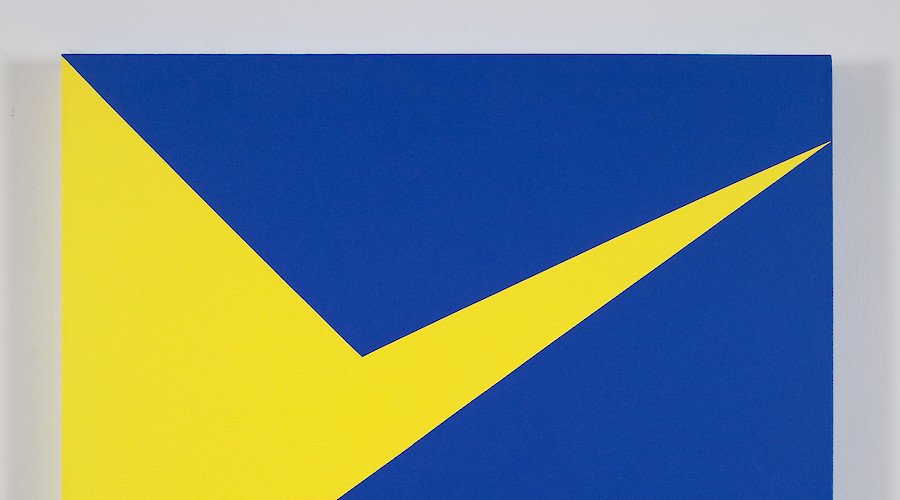
- The entire work uses a large area of blue as a stable field, allowing the yellow cut surface to achieve maximum penetration.
- Yellow is not a scattered patch of color, but a continuous structure that connects the upper left, lower left, and upper right directions.
- The central inflection point connects the downward pressure at the top with the diagonal advance at the bottom, forming a single and clear visual turn.
- The extremely narrow upper right corner gives the image a sudden sense of speed and sharpness amidst a calm background.
- The work relies almost entirely on proportion, angle, and boundary precision, rather than on layers and details.
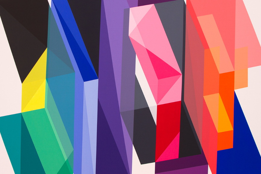
- The image first relies on the vertical columnar structure to establish order, allowing all color vibrations to adhere to an upward-moving overall framework.
- The beveled surface is not a partial decoration, but a source of visual speed; once a straight column is cut by a bevel, the color changes from static to a directional flow.
- Highly saturated colors are often placed at structural transitions, intersections of surfaces, and locations where visual impact is strongest, thus color acts as a "rhythm accelerator."
- The warm and cool relationships are not spread out evenly, but appear in blocks and sudden insertions, making the picture form a pulse-like rather than a uniform rhythm.
- The presence of black and dark gray is extremely crucial; they act like structural clamps, limiting the expansion of bright colors and allowing the image to maintain clear boundaries even amidst a sense of explosion.
- The left, middle, and right groups of units are not repeated evenly, but rather "isomorphic variation" is created by using different color gamuts and different oblique angles, so there are differences in the repetition.
- The colors are not simply juxtaposed, but rather the adjacent facets create brightness shifts, transparency illusions, and a sense of reflection, giving the plane a visual effect similar to the surface of a crystal.
- The sense of space in the work does not come from traditional perspective, but from the compression of front and back created by the interplay of color depth, edge sharpness, and the occlusion of forms.
- Large areas of vertical relationships maintain the structure of the work, while small areas of triangular cuts and diagonal folds constantly disrupt the sense of stillness, forming a dual mechanism of order and disturbance.
- The repetitive folded structure in certain areas causes the eye to bounce between different areas, creating a viewing experience similar to optical echo, which is an important source of the "vibration" feeling.
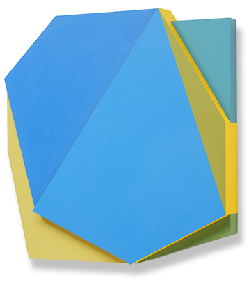
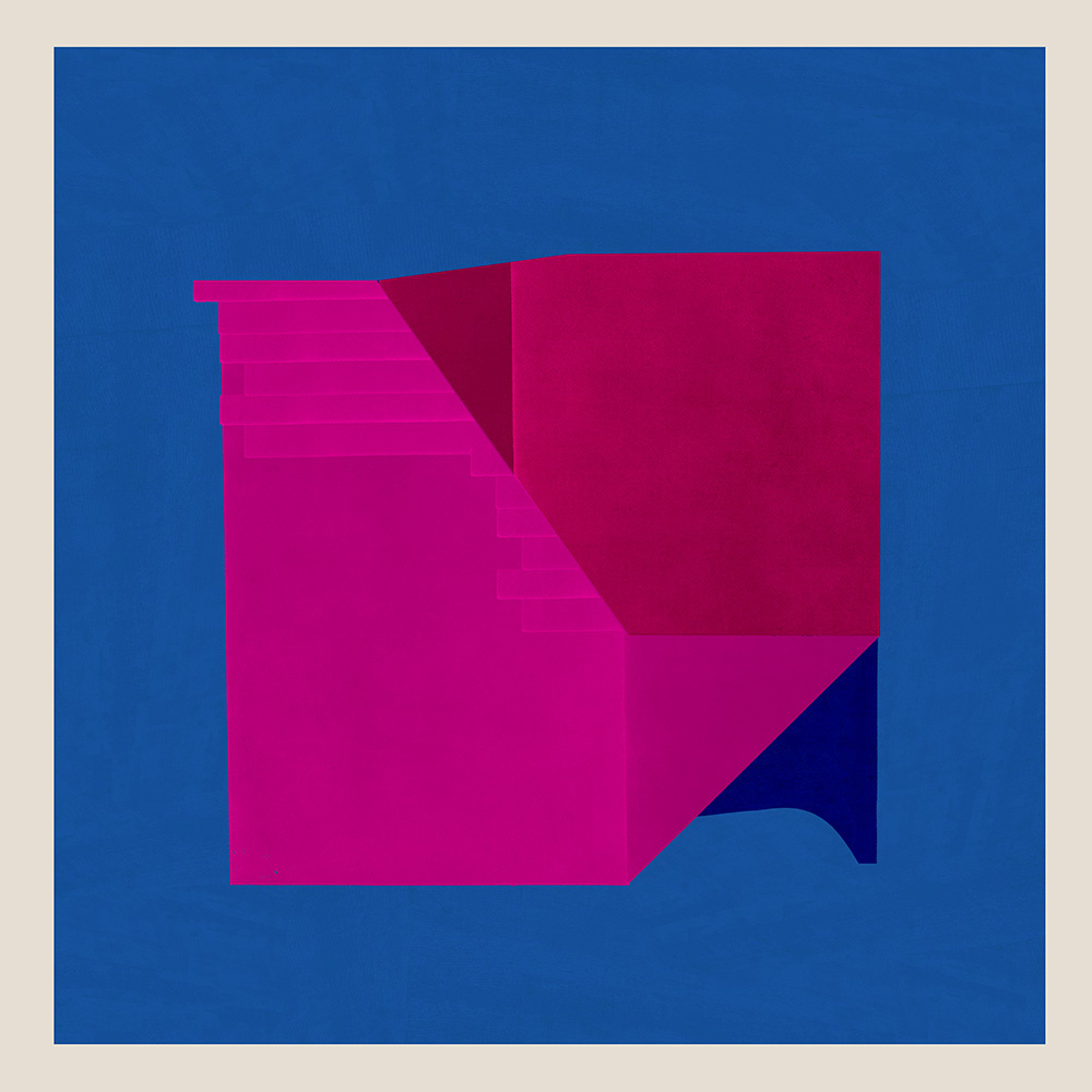
- The artwork replaces dense divisions with a few large forms, shifting the visual focus from decoration to the spatial relationship between the forms.
- The central main shape is not simply a flat plane, but rather creates a sense of restrained volume by using folds and bevels to create directional differences within the interior.
- The yellow panel in the lower left corner is not a supporting color block, but an important spatial basis for supporting, lifting, and offsetting the main shape.
- The cyan-blue vertical structure on the right provides a stable vertical order, creating a contrast between stillness and movement with the central blue sloping main shape.
- Although the narrow, golden edge is small in area, it plays a role in the rhythm transition and the brightening of the boundary, and is the key to the local imbalance.
- The panels are not completely fitted together, but rather create continuous tension through exposed edges, misalignment, coverage, and overhangs.
- The blank spaces and backgrounds in the artwork are not empty, but rather serve as breathing areas to participate in structural judgment, making the distance between entities perceptible.
- The overall color scheme is restrained, with no high-frequency noise, so viewers will naturally turn to the edges, angles, and hierarchical order.
- Localized shadows enhance the effect of the form detaching from the plane, placing the work somewhere between painting, relief sculpture, and wall composition.
- The so-called "reductive" does not mean reducing content, but rather compressing complexity into fewer units, making every relationship more precise.
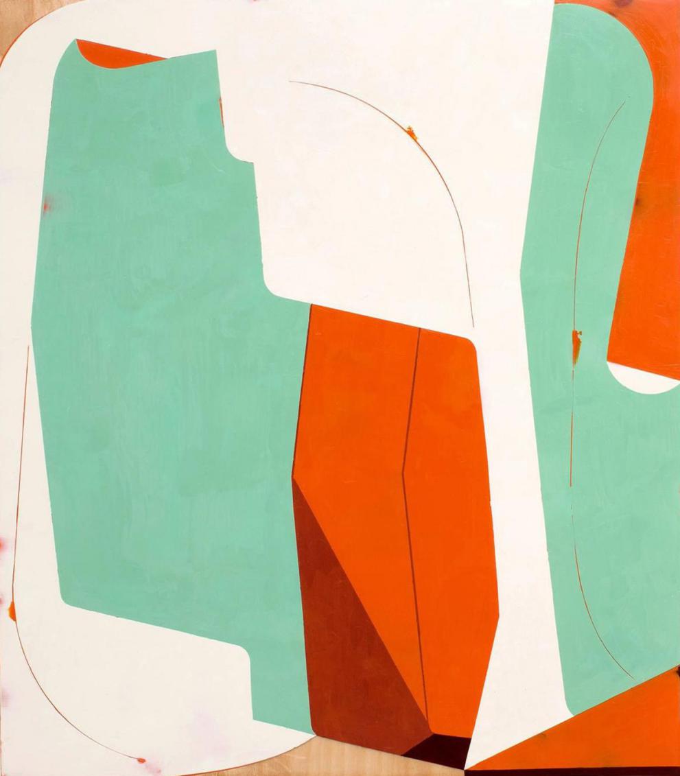
- The artwork no longer relies on the closed balance within a rectangular canvas, but instead establishes an open composition by expanding its boundaries.
- Large, irregular blocks resemble objects that have been cut, hung, or attached to a wall, thus naturally possessing an objectification tendency.
- The green shapes have the largest area, but they do not form an absolute center. They are more like two breathing surfaces on the left and right, responsible for expanding the picture.
- The central orange vertical block serves as the visual focal point, ensuring that the entire work maintains a focused force despite its open composition.
- The deep reddish-brown slope at the bottom is not just a simple shadow color, but a weighting device that gives the orange block a sense of volume, making it appear more substantial.
- The white blank space is not a residual background, but an important space that actively cuts, separates, buffers, and connects various shapes.
- The rounded corners, notches, curved turns, and abrupt cuts at the edges give the form both the attributes of soft gestures and hard composition.
- The fine, curved lines introduce bodily movements into the large plane, allowing the work to retain a sense of temporal flow beyond its structural integrity.
- Color does not pursue complex layers, but rather establishes clear volumetric relationships and spatial judgments using a few highly recognizable color gamuts.
- Open relationships are better than closed orders; the viewer's gaze will constantly wander among blocks, gaps, edges, and curves, rather than staying at a single center.
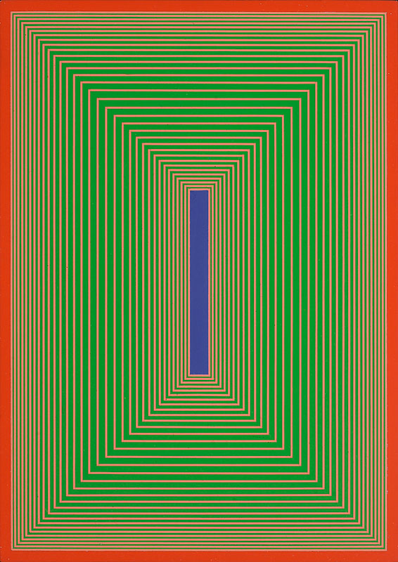
- Repeating stripes are not decorative fillers, but rather the most basic structural grammar of the entire work.
- The outer contour and the inner arc work synchronously, and the canvas shape itself directly participates in image generation.
- Each module is like a different sentence structure in the same system, adhering to unified rules while presenting local variations.
- Arcs are not natural curves, but rather strictly controlled band-shaped units, thus possessing a clear sense of order and calculability.
- Color is not a freely applied expression of emotion, but rather, like a sequence variable, it is redistributed across different modules.
- The upper arched module enhances the feeling of expansion, wrapping, and opening, while the lower rectangular module strengthens the relationship of cutting, compression, and transition.
- The undulating connecting boundaries in the middle break absolute symmetry, allowing slight instability and activity to be retained in the system's order.
- Thick borders not only separate modules, but also turn each part into an independent object unit, which is then pieced together into a larger object.
- A sense of space is not created through perspective, but rather through the objectivity of the canvas, the expansion of outlines, and the juxtaposition of modules.
- The viewing path is not a central focus, but rather involves comparing and moving back and forth between multiple units to perceive the rhythm of the system's progression.
- The circular frame is not an external decoration, but rather an active change in the way forces are applied to the vertical and horizontal systems.
- Black lines are used to establish the framework of order, determining the division, connection, and pauses between color blocks.
- Blue plays a stabilizing role over a large area and is the dominant color in the entire work, rather than simply filling in the color.
- Red appears only in key vertical positions, thus serving as a rhythmic accent and a structural boost.
- White is not a blank background, but rather a breathing zone, channel, and buffer surface in the proportional system.
- Asymmetrical distribution is more dynamic than mirror symmetry, allowing the image to retain internal tension while maintaining stability.
- The vertical relationship is significantly stronger than the horizontal relationship, giving the work a sense of rising, standing, and support.
- Although the black horizontal block in the lower right corner is not large, it acts like a ballast stone to stabilize the structure on the right side.
- The color blocks cut off by arcs at the edges indicate that the composition does not spread outward from the center, but rather that the edges and the center work together to achieve balance.
- The differences in proportion, positional offset, and spacing control determine the overall tension more than the number of color blocks themselves.
- Although the image has a partitioned structure, what really matters is not the closed grid lines, but the constantly opening boundary relationships between the blocks.
- The curved surface, leaf shape, and oblique cut surface together weaken the rigidity of the hard mesh, making the structure more similar to growth, drift, and respiration.
- Layering color is more important than hard cutting; many areas are not single color blocks, but retain traces of the covering, wiping, and residual processes.
- The yellow horizontal stripes, like light or airflow, run through multiple sections, serving as connections and transitions, rather than being isolated decorative strips.
- The blue and green shapes do not create a sharp conflict, but rather maintain a gentle rhythmic change through differences in brightness, area, and direction.
- The gray and white areas are not passive backgrounds; they act like air layers, pauses, and breathing zones, keeping the image open and relaxed.
- Leaf-like shapes are generative; they are not fixed like geometric templates, but rather like natural symbols that may continue to stretch or turn at any time.
- The surface texture, the sense of wear and tear, and the slightly dirty layers of color add a sense of time, giving the work a process-oriented rather than a cold, hard feeling of a one-time completion.
- The irregular edges give each unit an incomplete feel, thus weakening the final composition and strengthening the sense of unfolding.
- The entire work is not established by a single focal point, but rather by the resonance, response, and flow between multiple flexible nodes to maintain overall order.
- The work establishes order with very few geometric units, with rectangles and semicircular cross-sections forming the basic grammar of the entire structure.
- Black primarily serves as the skeleton, responsible for boundaries, weight distribution, and module separation.
- Turquoise is not a decorative color, but rather an active surface in the structure, responsible for unfolding, breathing, and visual flow.
- The white space is not a background, but rather participates in the composition as a pause, transition, and proportion control.
- The upper cyan semicircle presses downward into the black field, while the lower black semicircle cuts to the left into the cyan field, creating a reciprocal echo.
- The vertical blue bar on the left and the vertical black block on the right form two supporting ends, maintaining a balance between openness and contraction in the image.
- The semicircular relationship weakens the mechanical feel of a pure rectangular system, allowing a soft rhythm to emerge from the calm order.
- The modules are not continuously attached to each other, but are separated by white channels, so the spacing itself becomes the source of the beat.
- Although the number of colors is small, the precise placement and clear area create a high reading density.
- The overall composition does not follow the traditional central theme. Instead, it establishes a system balance through vertical echoes, horizontal emphasis, and central spacing.
- The central black vertical bar serves as the primary structural axis and is the most important element supporting the overall order of the work.
- The adjacent narrow orange stripe is not an accompaniment, but rather creates a faster tempo through the difference in width and brightness.
- The orange ramp on the left and the blue ramp on the right are not mirror images, but rather maintain a difference in direction while maintaining approximate equilibrium.
- The black capping at the top right connects with the blue curved surface, creating a flexible flow on the right side within the hard-edged structure.
- The darker blue-gray area in the lower left corner acts as a weight, preventing the large orange area on the left from appearing too floating.
- The thin, white, sloping surfaces on both sides resemble controlled gaps, serving to separate, allow air to pass through, and brighten the boundaries.
- The light purple-gray background is not a passive substrate, but an important buffer layer that keeps the internal high-purity color relationships clear and restrained.
- The white rectangle at the top, together with the central circular node, gives the vertical structure a clear starting point and pause, rather than simply running through it.
- Stripes, color planes, backgrounds, and borders together create a progressive order, rather than a pattern arrangement on a single plane.
- The entire work uses very few variables to create a rich rhythm, demonstrating that a simple structure can also carry delicate and poetic rhythmic variations.
- The unified module first establishes an order base, and all changes must occur within the same structural syntax.
- Each unit consists of a square hollow structure, straight edges, and beveled corners, thus exhibiting a highly readable structural pattern.
- Colors are not applied freely and lyrically, but rather rotate in the same module like variable substitution.
- The four modules are isomorphic to each other, but local differences are created through color shifting and directional alignment, thus the unity contains variations.
- The central intersection is an important structural node of the entire work, where the edges of each unit visually converge.
- The white central hole is not empty, but rather used to maintain rhythm, reinforce the module borders, and improve overall clarity.
- The large area of external white space supports the central module group, making the internal high-saturation color relationship more concentrated and accurate.
- The beveled edges soften the rigidity of the pure square system, making the transitions between modules more fluid.
- The distribution of red, blue, green, and orange is not evenly spread out, but rather creates a shift in temperature and visual jumps through their adjacent relationships.
- Change follows rules and does not depend on chance; therefore, the image does not give people a sense of chaotic abundance, but rather a precise and clear sense of order.
- Layered structures are more important than single-plane divisions; the true composition occurs in the relationship between materials.
- The vertical banded order provides a clear framework, ensuring that various materials and lighting effects do not lose overall control.
- Highly saturated magenta and red provide the initial impact, quickly establishing the visual temperature and rhythm of the artwork.
- Natural wood grain panels break away from the monotony of purely industrial colors, bringing a sense of time, materiality, and handcrafted traces into the geometric system.
- The light purple, yellow, and green areas are not simply juxtaposed, but rather exhibit overlapping, refraction, and edge penetration relationships.
- The large, dark green main body provides visual weight, preventing the bright yellow layer in the center from appearing floating.
- The orange and white edge on the right resembles a gradually fading band of light, allowing the artwork to retain a sense of airiness and lingering charm even as it comes to a close.
- The increased edge thickness enhances the sense of objectivity, indicating that this is not a color that is "painted on," but rather a color layer that "exists as an object."
- The alternation of transparent and opaque materials creates depth not through perspective, but through realistic layers.
- The color relationships change with the viewing position and lighting, thus the artwork has a temporal aspect rather than a one-time reading.
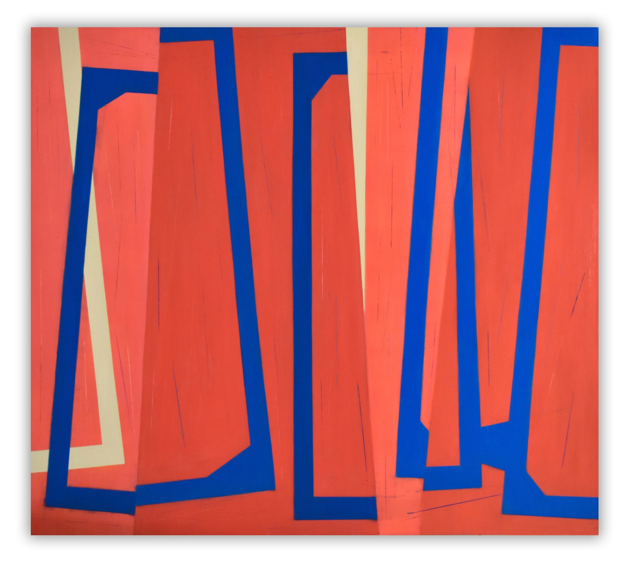
- The artwork does not rely on a stable grid, but rather establishes an overall order through tilting, intersecting, and sliding relationships.
- Semi-transparent surfaces are more important than single solid color blocks because spatial illusions mainly come from the layering changes after overlapping.
- The central deep blue and orange-red diagonal strips form the core axis, which is the strongest guiding line of the entire work.
- The large, sloping light blue and turquoise surfaces on the left provide a sense of expansion, giving the image a tendency to be rotated and flipped from the very beginning.
- The yellow-green strip on the right side, together with the purple surface, forms a second support system, making the right half appear both upright and tilted.
- The deep blue background is not an empty space, but a spatial base that unifies all the floating geometric panels.
- The sharp angles and the slant of the long side enhance the sense of instability of the structure, keeping the eye constantly on edge.
- Color partitioning not only distinguishes different panels, but also helps viewers identify orientations, turns, and front and back occlusions.
- The artwork does not have a single center, but instead uses multiple diagonal lines of force to continuously draw the eye from the lower left to the upper right, and then back to the center.
- Painterliness and sculptural quality are not opposites here; the flat color achieves a sense of volume precisely through the objectified edges.
- The central slender rectangle is used to establish the focal point first, so that all repeating structures converge toward a clear core.
- The rectangular lines are not repeated randomly, but rather form a calculable optical rhythm through equidistant progression.
- The extensive use of green provides a continuous vibrational atmosphere, while the pink and orange lines divide this vibration into high-frequency pulses.
- The red and orange outer frame resembles a temperature and pressure field, responsible for enveloping all internal relationships and enhancing the overall feeling of warmth.
- The blue center, due to its strong contrast with the surrounding warm colors and highly saturated green, appears activated as if it were a cold light source.
- Adjacent color relationships are more important than single color blocks; true radiance comes from edge collisions rather than localized gradients.
- The repetitive rectangle creates a dual illusion of inward inhalation and outward expansion, making the image resemble both a passageway and a radiation source.
- The more precise the proportions, the stronger the optical vibrations; any imbalance in spacing will disrupt the overall stability of light emission and beam convergence.
- The pattern is not a decoration attached to the surface, but rather it forms an overall structure together with the boundaries.
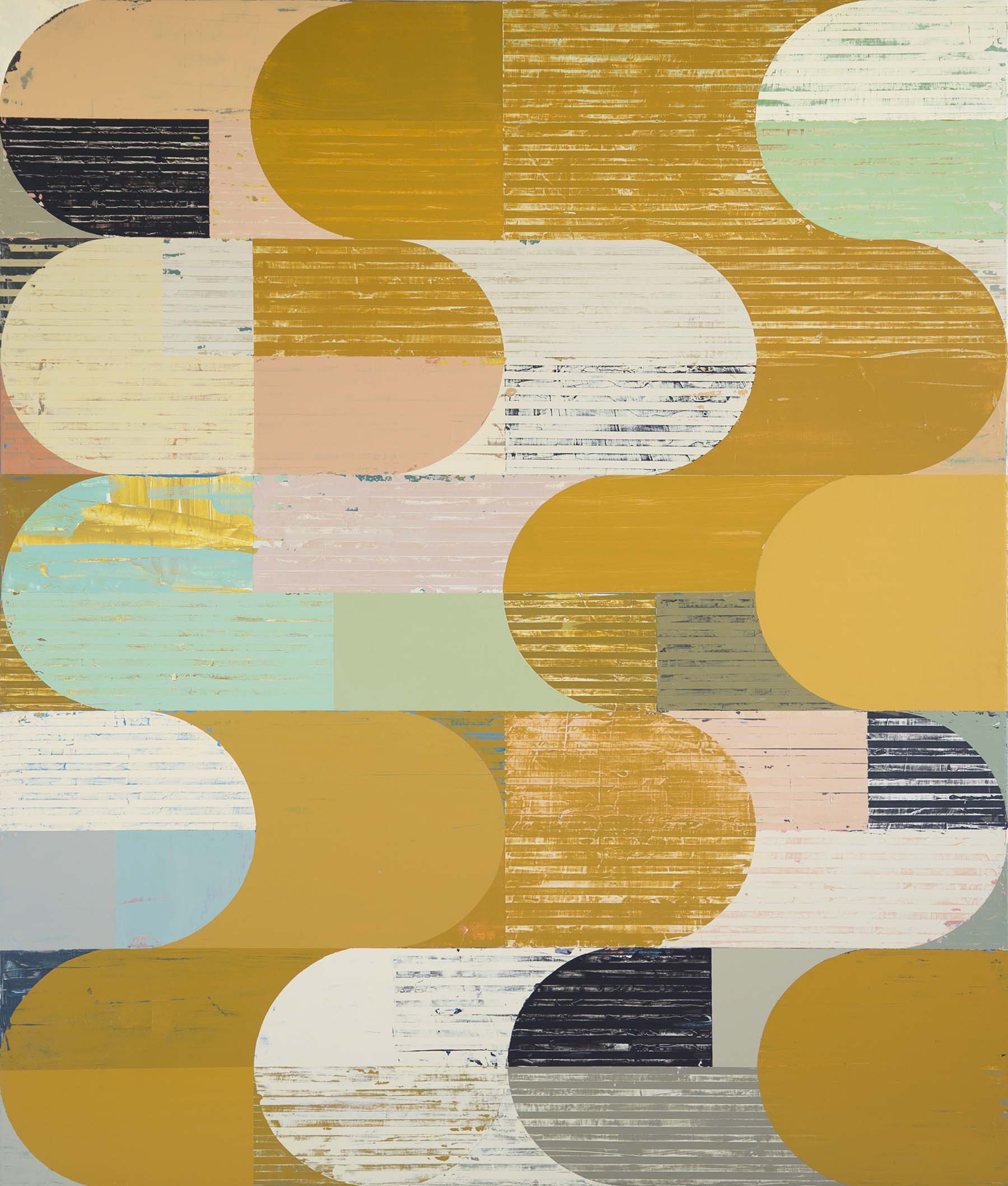
- The tan-colored modules appear repeatedly, like a basic layer in the system, responsible for connecting the entire screen.
- The semicircles, rounded rectangles, and horizontal stripes are repeated, but their length and position are slightly modified each time.
- Repetition is not mechanical copying, but a modified repetition with a sense of manual adjustment.
- The scratches, indentations, and wear on the surface give the geometry a sense of time and material.
- Dark, short bars act like pauses in a rhythm, creating clear anchor points between low-saturation color blocks.
- Horizontal layers are key to organizing the image, allowing the reading experience to progress in a linear fashion.
- Many shapes are truncated at the edges, indicating that the border itself is a shape generator.
- Rules precede results; the entire work is more like a visual presentation of a geometric program being executed.
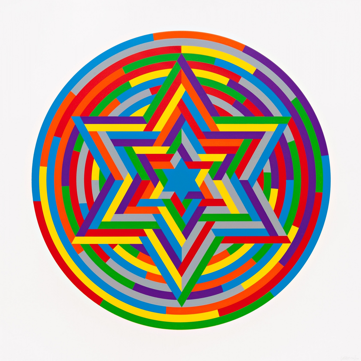
- The uniformly wide colored stripes are the most basic grammatical units; all complexity arises from their interleaving, turning, and nesting.
- The concentric rings are responsible for establishing the outer rhythm, creating a continuous and uniform sense of expansion when viewed.
- The interlaced hexagonal structure is responsible for creating dense interweaving and directional conflict in the central area, thereby increasing structural tension.
- A circular boundary is not simply an outer frame, but rather a way to gather all the internal sequence relationships into a complete object.
- Color is not a free expression of emotion, but rather, like a system variable, it constantly rotates within the same banded structure.
- The central small star image compresses the focal point, while the large star image unfolds into structural layers, creating a clear progression in scale.
- The interlacing relationship of the strip units creates an illusion of depth in the plane, as if some parts of the structure are floating up and others are sinking down.
- Repetition is not mechanical copying, but rather a process of continuous nesting and shifting within repetition, thus maintaining vitality within the order.
- The focus of appreciating the entire work is not on individual color blocks, but on how rules, sequences, directions, and color rotations together constitute the whole.
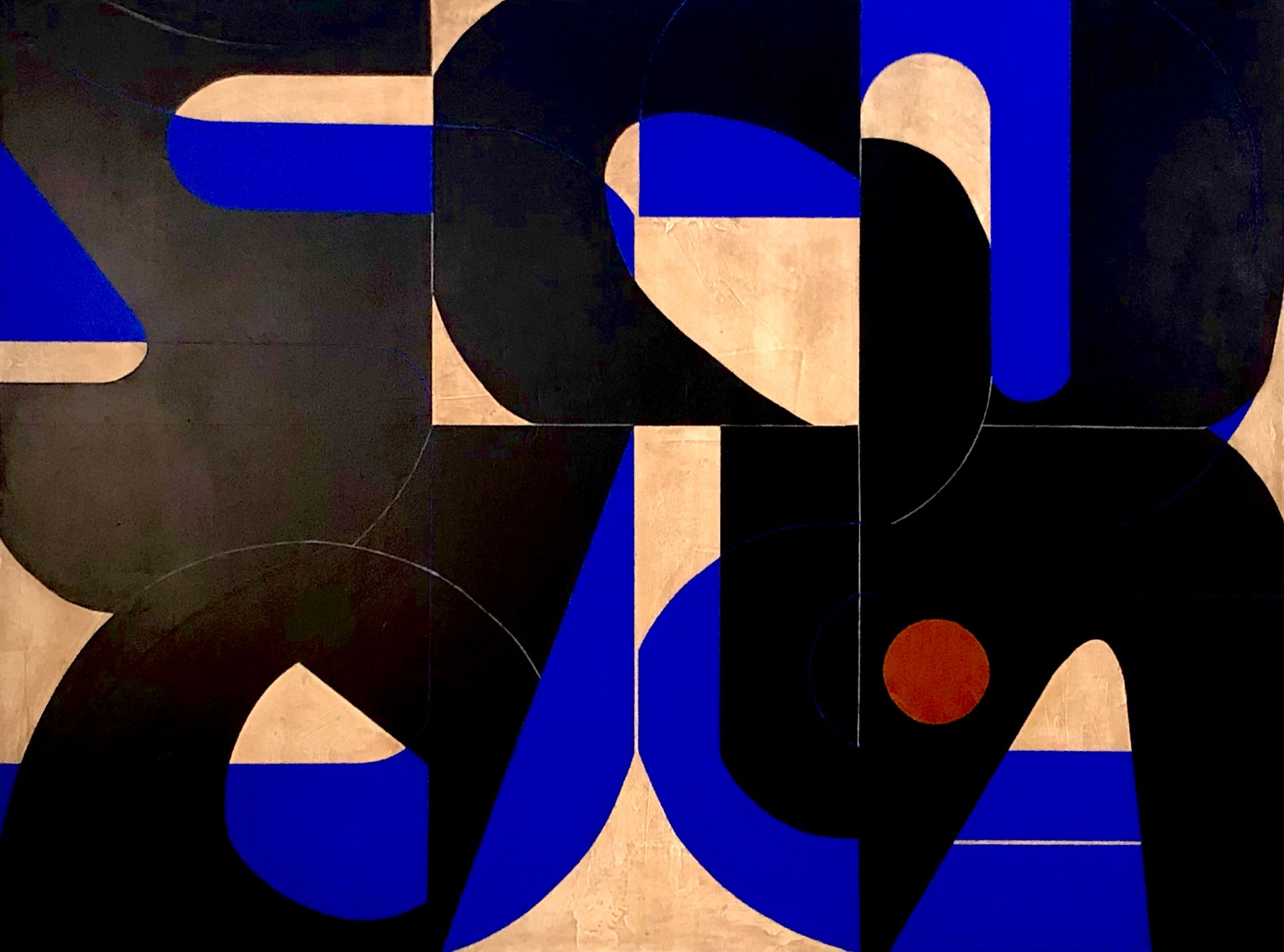
- The layering determines the surface complexity; black, blue, and warm background are not laid out side by side, but rather overlapped one after the other.
- The large black shape plays a dominant structural role, serving as the most important covering and skeletal layer of the entire work.
- Blue is not an accompaniment, but a mid-layer highlight used to activate boundaries, change direction, and create strong visual cuts.
- The warm beige base provides a sense of materiality and a calm atmosphere, allowing the high-contrast relationship to be established on a stable foundation.
- Rounded corners, arches, semicircles, and bevels work together to reduce the rigidity of a pure rectangular system, making the structure more fluid.
- Block partitioning is merely an implicit framework; what truly matters are the black main blocks and blue transition surfaces that move across blocks.
- Although the small rust-orange dots are small, they form an important rhythmic accent in the large area of cool and dark colors.
- The intersection of boundaries is more important than the size of simple color blocks; the meaning of many shapes comes from the residual outlines after they have been occluded or truncated.
- The decorative aspect of the work is not superficial, but rather based on the coexistence of highly recognizable colors and a rigorous structural relationship.
- The sense of depth on a surface does not depend on realistic shadows, but rather on the order of color layer coverage and the relationship between edges.
- The repeating grid is the basic grammar of the entire work; all illusions are built upon a unified sequence.
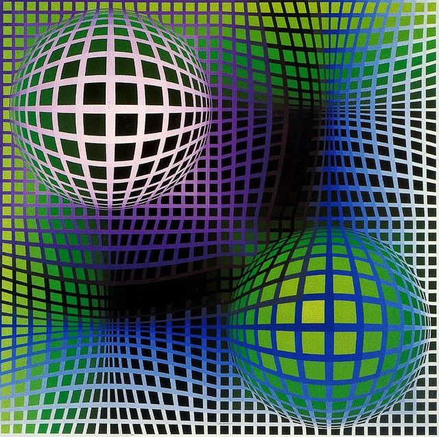
- Once the grid is bent, stretched, and compressed, the plane will be viewed as an elastic spatial field.
- The bulging areas in the upper left and lower right corners are not drawn spheres, but rather an illusion of volume created by the outward expansion of the grid.
- The black, twisted band in the center-right area creates a sense of a deep, inward-pushing hole through extreme darkening and mesh contraction.
- The difference in light and dark is more important than local details; the protrusion and recession are primarily determined by the judgment of light and shadow.
- The continuous transition of cool colors makes the spatial illusion more fluid, and it does not remain at the level of a single black and white illusion.
- The white grid is not a background line, but the optical structure itself; without it, the bulging and distortion would lose their readability.
- Local changes must conform to the overall field. No single square is important; what matters is how the entire grid deforms continuously.
- The visual speed of the center and the edge is different. The edge is more like a stretched frame, while the center bears the strongest distortion and energy concentration.
- The sense of movement in the artwork is not actual movement, but rather a dynamic experience created by the eye constantly correcting its spatial perception during the viewing process.
- The thickness of the material enhances the sense of real existence of the composition, making geometry no longer just an image, but an object.
- The white dividing lines are not decorative outlines, but rather a direct representation of the joints between the panels and the structural relationship.
- The bright blue areas serve to expand the main structure, while the darker areas are responsible for weighting, converging, and stabilizing the overall composition.
- The brush marks and surface rubbing allow the color to retain the manufacturing process, preventing it from degenerating into an overly smooth industrial finish.
- The external wooden frame is not an additional border, but rather a building container that provides support and contrast for the sloping internal structure.
- The main body does not completely fill the frame, but creates a sense of tension and breathability through empty spaces and suspension.
- The slanted boundaries and triangular units constantly change orientation, making the viewer feel that the structure is folding, turning, and being stressed.
- The shadows on the wall become additional lines as the light changes, causing the boundaries of the artwork to extend further into the real space.
- Craftsmanship and artistry coexist here, and the splicing method itself is part of the visual language.
- The surface, structure, frame, and walls are inseparable; removing any part will weaken the spatial composition of the artwork.
- The diagrammatic relationships precede the closed shape; the blue structure is more like a path marker, a framing device, and a spatial indication than a complete entity.
- The warm orange-red background forms a unified field, making all the blue frames appear to be continuously projected on the same high-pressure background.
- Empty frames are more important than solid blocks because leaving them blank keeps the structure open, emphasizing relationships rather than filling in the result.
- The left and right tilted frame creates offset and instability, while the more upright frame in the middle provides the necessary support for order.
- The width, angles, and opening patterns of the blue structures are not entirely consistent, thus retaining the vitality of continuous modification during repetition.
- The thin, light beige slits and the white edges create breathing spaces within the heavy, warm background, preventing the image from being completely closed off.
- Scratches, scratches, and fine line traces preserve the thought process behind the craft, giving the work both graphic clarity and a sense of time on the surface.
- Geometry here is not just a form, but the path of thought itself; each edge is like an illustration of a directional judgment and a boundary test.
- The explicit blue outline and the implicit scratches work together to create two layers of reading: the "visible structure" and the "structure that is still being formed".
- The complexity of the work does not come from the number of graphics, but from the continuous deduction of interlocking frames, directional offsets, white space at openings, and differences in layers.
- Beneath its minimalist appearance lies precise proportion control; the true complexity lies in the edges, chamfers, and hierarchical relationships.
- The blue background is not a passive substrate, but rather a static field that stabilizes the entire composition, making the central assembled block appear more focused.
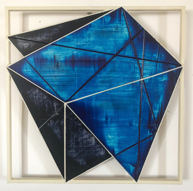
- The central magenta main surface bears the main visual weight and is the most direct foreground structure of the entire work.
- The thin layers that recede continuously in the upper left corner resemble modules that are pushed out in segments, creating a rhythmic, digital, and graphical feel.
- The deep magenta oblique cut in the upper right corner resembles a wedge-shaped component pressed into the main structure, responsible for changing the overall orientation and center of gravity.
- The dark blue triangle in the lower right corner and the small curved notch are crucial; they transform the artwork from a complete block into an object with a more assembled feel and a sense of internal space.
- The white borders support the internal blue field and the central block as a whole, making the structural relationships clearer and more independent.
- Edge relationships are more important than brushstrokes; almost all tension comes from tangents, angles, cuts, and adjacency patterns.
- Numerical thinking is reflected in clean outlines and highly restrained use of variables; there are few changes, but every single one is precise and effective.
- The work does not depict objects, but rather demonstrates an abstract logic of "how components form a whole".
- Patterns and color gradations work together to create depth; the sense of space comes primarily from the organization of layers, rather than from perspective.
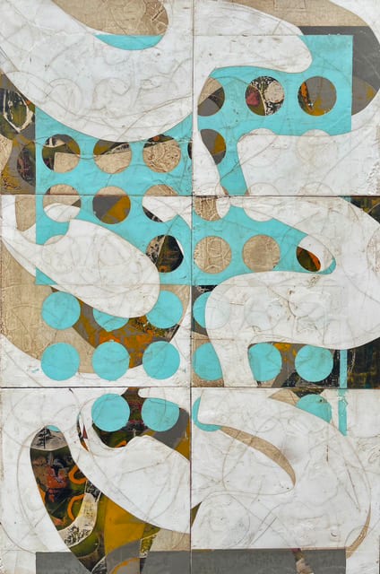
- The large, white, curved shape is not a passive blank space, but rather the foremost flowing structure responsible for crossing zones and connecting the screen.
- The bluish-green perforated plates, resembling survey templates or a system of symbols, are the primary source of the middle-level order.
- The underlying brown-gold, gray-black, and variegated collages provide a sense of sedimentation, giving the image a temporal quality similar to strata, ruins, or map bases.
- The rectangular partitions are just the initial framework; the real composition comes from these blocks being continuously reconnected by white curved surfaces and circular hole structures.
- The repetition of dots and holes is not mechanical decoration, but rather a way to create variations in density and visual resonance in different areas.
- Local textures, scratches, and embossing marks free the geometric relationships from a pure industrial feel, instead giving them a sense of handcrafted correction and material memory.
- Hierarchical relationships are more important than individual graphics; the same hole or curve can play completely different roles at different depths.
- Abstract space originates from occlusion, exposure, passage, and pattern density, rather than from vanishing point perspective.
- The work combines patterns, collage, a sense of map and geometric order, allowing the viewer to switch back and forth between reading and wandering.
The power of classic abstract geometric works comes not from intuitive color choices, but from clear and restrained color structures. This exercise systematically deconstructs representative works to analyze the distribution, proportion, and relationships of colors within geometric frameworks, and to understand how color participates in spatial construction and the generation of order. The focus is not on evaluating the style of the works, but on identifying their color logic, thereby transforming subjective visual perception into structural experience that can be understood and applied.